
Creating Custom Kibana Visualizations
June 5, 2019
As you may very well know, Kibana currently has almost 20 different visualization types to choose from. This gives you a wide array of options to slice and dice your logs and metrics, and yet there are some cases where you might want to go beyond what is provided in these different visualizations and develop your own kind of visualization.More on the subject:
In the past, extending Kibana with customized visualizations meant building a Kibana plugin, but since version 6.2, users can accomplish the same goal more easily and from within Kibana using Vega and Vega-Lite — an open source, and relatively easy-to-use, JSON-based declarative languages. In this article, I’m going to go show some basic examples of how you can use these frameworks to extend Kibana’s visualization capabilities.
Vega and Vega-Lite
Quoting the official docs, Vega is a “visualization grammar, a declarative language for creating, saving, and sharing interactive visualization designs.” Vega allows developers to define the exact visual appearance and interactive behavior of a visualization. Among the supported designs are scales, map projections, data loading and transformation, and more.
Vega-Lite is a lighter version of Vega, providing users with a “concise JSON syntax for rapidly generating visualizations to support analysis”. Compared to Vega, Vega-Lite is simpler to use, helps automate some of the commands and uses shorter specifications. Some visualizations, however, cannot be created with Vega-Lite and we’ll show an example below.
Setting up the environment
For the purpose of this article, we deployed Elasticsearch and Kibana 7.1 on an Ubuntu 18.04 EC2 instance. The dataset used for the examples are the web sample logs available for use in Kibana. To use this data, simply gop to Kibana’s homepage and click the relevant link to install sample data.
Example 1: Creating a custom bar visualization
Like any programming language, Vega and Vega-Lite have a precise syntax to follow. I warmly recommend to those exploring these frameworks to check out the documentation.
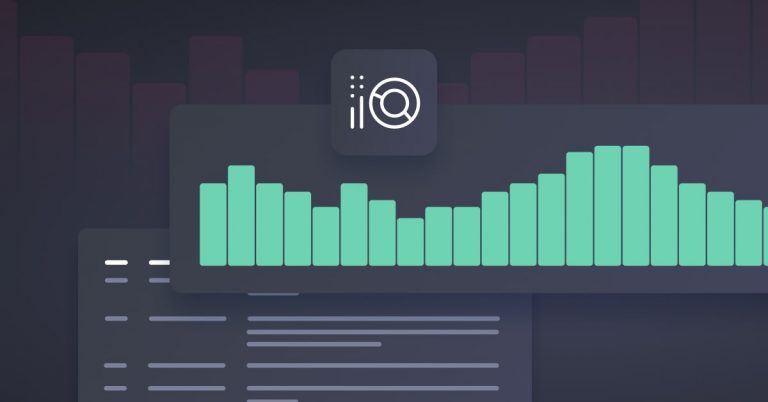
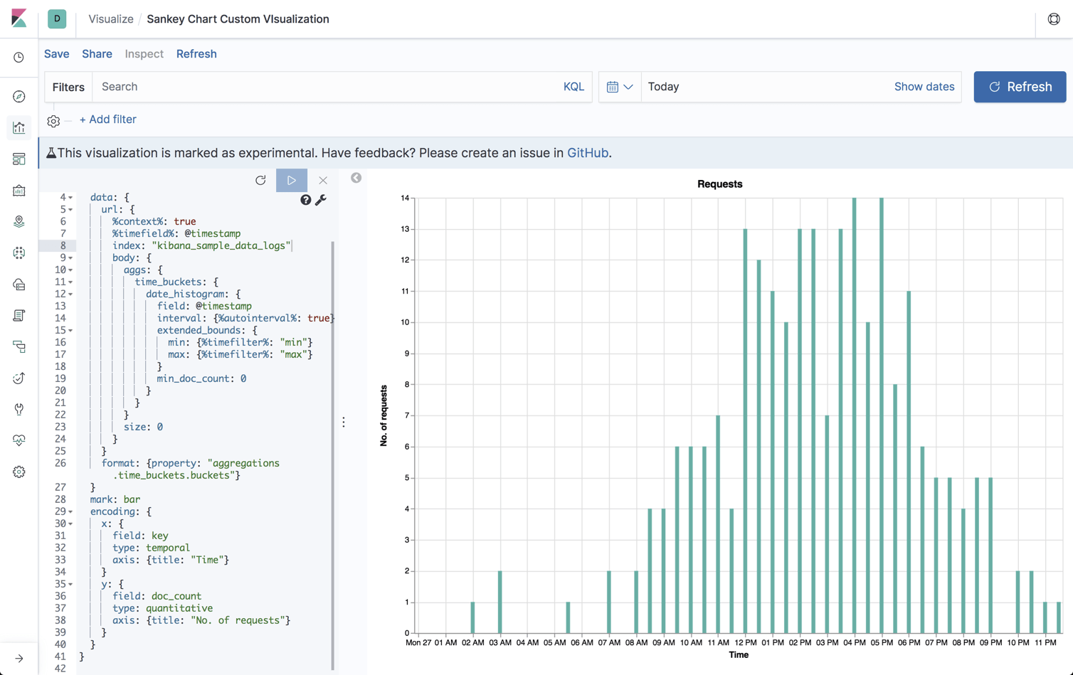
For the sake of understanding the basics though, I’ll provide a very simple Vega-Lite configuration that visualizes the number of requests being sent to our Apache server over time. Yes, I know, the same can easily be done with the provided bar/area/line charts in Kibana but the purpose here is to illustrate the basics of Vega-Lite declarations, so please bare with me.
As seen in the example below, the JSON syntax contains the following specifications:
- $schema – URL to Vega-Lite JSON schema
- title – a title of the visualization
- data – an Elasticsearch query defining the dataset used for the visualization (e.g. the Elasticsearch index, timestamp, etc.)
- mark – the visual element type we want to use (e.g. circle, point, rule)
- encoding – instructs the mark on what data to use and how
Example (full):
{
  $schema: https://vega.github.io/schema/vega-lite/v2.json
  title: Requests
  data: {
    url: {
      %context%: true
      %timefield%: @timestamp
      index: kibana_sample_data_logs
      body: {
        aggs: {
          time_buckets: {
            date_histogram: {
              field: @timestamp
              interval: {%autointerval%: true}
              extended_bounds: {
                min: {%timefilter%: "min"}
                max: {%timefilter%: "max"}
              }
              min_doc_count: 0
            }
          }
        }
        size: 0
      }
    }
    format: {property: "aggregations.time_buckets.buckets"}
  }
  mark: bar
  encoding: {
    x: {
      field: key
      type: temporal
      axis: {title: "Time"}
    }
    y: {
      field: doc_count
      type: quantitative
      axis: {title: "No. of requests"}
    }
  }
}

Vega-Lite of course can be used for much more than this simple chart. You can actually transform data, play with different layers of data, and plenty more.
Example 2: Creating a Sankey chart visualization
Our next example is a bit more advanced — a Sankey chart that displays the flow of requests from their geographic source to their geographic destination.
Sankey charts are great for visualizing the flow of data and consists of three main elements: nodes, links, and instructions. Nodes are the visualization elements at both ends of the flow — in the case of our Apache logs — the source and destination countries for requests. Links are the elements that connect the nodes, helping us visualize the data flow from source to destination. Instructions are the commands, or the lines of JSON, which help us transform the Sankey Chart according to our needs.
In the example below we are using Vega since Vega-Lite does not support the creation of Sankey Charts just yet. Again, I can’t go into all the details of the configuration but will outline some of the main high-level components:
- $schema – URL to Vega JSON schema
- data – the dataset used for the visualization
- transform – various processing applied to the data stream (e.g. filter, formula, linkpath)
- scales – calculates the stack positioning in the chart
- marks – connects the lines between the stacks
- axes – visualizes spatial scale mappings with ticks
- signals – highlights the traffic to/from the source/destination
Example (shortened):
The full JSON configuration of the Sankey chart displayed below is simply too long to share in this article. You can take a look at it here.
Note the Vega schema used here, as well as the two sources based on the geo.src and geo.dest fields in our index.
Schema/data declaration
{
  "$schema": "https://vega.github.io/schema/vega/v3.0.json",
  "data": [
    {
      "name": "rawData",
      "url": {
        "%context%": true,
        "%timefield%": "timestamp",
        "index": "kibana_sample_data_logs",
        "body": {
          "size": 0,
          "aggs": {
            "table": {
              "composite": {
                "size": 10000,
                "sources": [
                  {
                    "stk1": {
                      "terms": {
                        "field": "geo.src"
                      }
                    }
                  },
                  {
                    "stk2": {
                      "terms": {
                        "field": "geo.dest"
                      }
                    }
                  }
                ]
              }
            }
          }
        }
      },
….
Axes
....
"axes": [
    {
      "orient": "bottom",
      "scale": "x",
      "encode": {
        "labels": {
          "update": {
            "text": {
              "scale": "stackNames",
              "field": "value"
            }
          }
        }
      }
    },
    {"orient": "left", "scale": "y"}
  ],
….
Marks
….
"marks": [
    {
      "type": "path",
      "name": "edgeMark",
      "from": {"data": "edges"},
      "clip": true,
      "encode": {
        "update": {
          "stroke": [
            {
              "test": "groupSelector && groupSelector.stack=='stk1'",
              "scale": "color",
              "field": "stk2"
            },
            {
              "scale": "color",
              "field": "stk1"
            }
          ],
          "strokeWidth": {
            "field": "strokeWidth"
          },
          "path": {"field": "path"},
          "strokeOpacity": {
            "signal": "!groupSelector && (groupHover.stk1 == datum.stk1 || groupHover.stk2 == datum.stk2) ? 0.9 : 0.3"
          },
          "zindex": {
            "signal": "!groupSelector && (groupHover.stk1 == datum.stk1 || groupHover.stk2 == datum.stk2) ? 1 : 0"
          },
          "tooltip": {
            "signal": "datum.stk1 + ' → ' + datum.stk2 + '\t' + format(datum.size, ',.0f') + '   (' + format(datum.percentage, '.1%') + ')'"
          }
        },
        "hover": {
          "strokeOpacity": {"value": 1}
        }
      }
    },
….
The final outcome of this JSON when we run it should look something like this: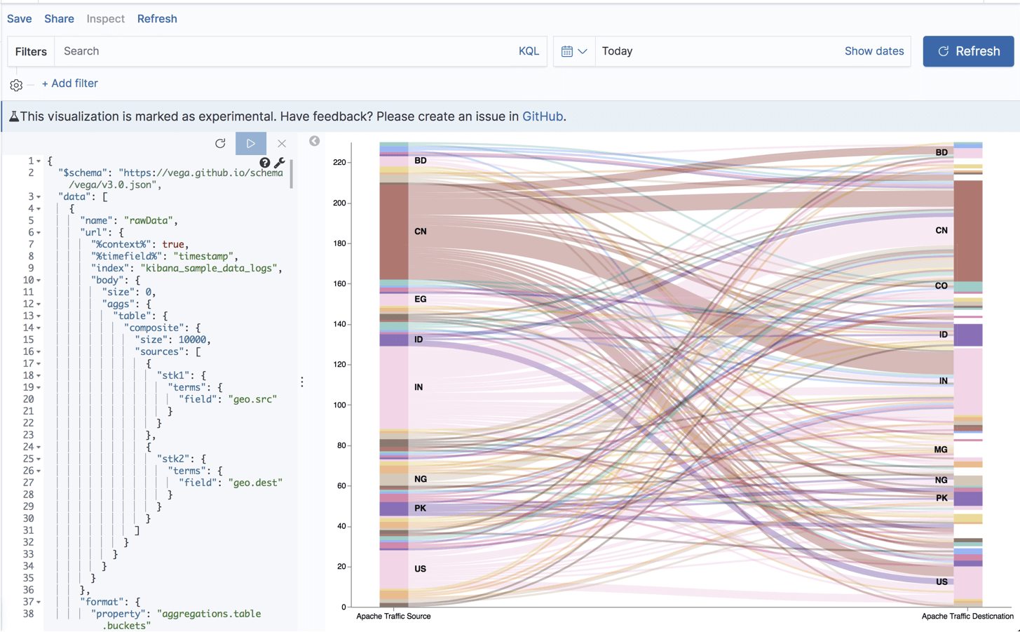
Endnotes
Kibana is a fantastic tool for visualizing your logs and metrics and offers a wide array of different visualization types to select from. If you’re a Kibana newbie, the provided visualizations will most likely suffice.
But more advanced users might be interested in exploring the two frameworks reviewed above as they extend Kibana with further options, opening up a world of visualization goodness with scatter plots, violin plots, sunbursts and a whole lot more.
Allow me to end with some small pointers to take into consideration before you dive into the world of Vega and Vega-Lite for creating your beautiful custom visualizations:
- Vega and Vega-Lite visualizations in Kibana are still defined as experimental.
- You will need to have a good understanding of ELK, especially Elasticsearch and Kibana.
- Basic JSON skills are definitely a plus as it will make configuring the visualization much simpler.
If you’re still unsure whether it’s worth the effort, check out the available examples.
Enjoy!
You Might Also Like

Historical data analytics with Logz.io
