Unreadable Metrics: Why You Can’t Find Anything in Your Monitoring Dashboards
January 3, 2023
This is the third blog in our series on Monitoring Essentials. To learn more, check out these posts on Phantom Metrics and Expensive Metrics.
Dashboards are powerful tools for monitoring and troubleshooting your system. Too often, however, we run into an incident, jump to the dashboard, just to find ourselves drowning in endless data and unable to find what we need. This could be caused not just by the data overload, but also due to seeing too many or too few colors, inconsistent conventions or the lack of visual cues. We then need to waste precious time deciphering the dashboard rather than investigating the case at hand, and end up frustrated.
Dashboards are a tricky thing. It’s not enough to just have all the data needed: the dashboard needs to be designed in a way that allows users easily access and interpret the data. It requires more than the engineer mindset to do it right. Take these two guiding principles:
When designing a dashboard, think like a UX designer, and keep it simple.
In this guide, we’ll go over the basics of effective dashboard design, and how to create a dashboard that will make it easy for you to troubleshoot an incident.
Understand your dashboard’s user persona and use case
Start with understanding the persona of the user who will utilize the dashboard. After all, you’re not writing the dashboard to yourself (unless you do). Adapt your dashboard to the familiarity and knowledge level of that persona.
If needed, add static text inside the dashboard to provide background on the metrics, their meaning and upstream origin, as well as potential downstream dashboards, runbooks or other actions to consider.
Equally important is to define the use case the dashboard aims to serve, and keep the dashboard design focused on the data and visualizations that serve this use case. If the dashboard grows too big and broad, consider splitting it into several more targeted dashboards. Taking an example from the Kubernetes domain, I may want to have a dashboard showing the pod status, and a separate dashboard showing the cluster status, and not mix the two.
This guiding principle of focus applies down to the individual panels and visualizations. Each visualization should have a clear question it comes to answer. You should be able to answer the defined question when looking at the visualization, without doing much additional analysis in your head.
Remember that simplicity is key for dashboard design. Too many visualizations and data points can be overwhelming and make it difficult to find the information you’re looking for. Keep your dashboard focused on your use case and try to avoid adding unnecessary elements.
Utilize the right data visualizations
The best dashboards use the right visualizations to convey the most important information. For example, a graph might be a better choice than a table for displaying trends over time, while a pie chart might be a better choice than a line chart for comparing proportions between different groups. Try to use the visualization that best conveys your data.
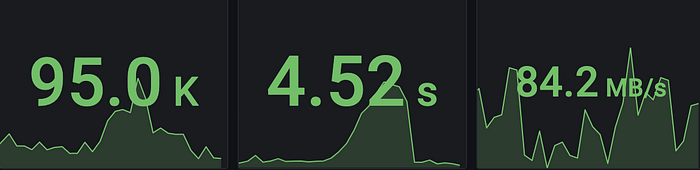
Sometimes a single number or a visual status indicator is more helpful than a ton of line graphs and data points. For example just showing the P99 (99th percentile) current latency as a single digit top-level figure, over showing all 5 different percentiles over time. Remember: keep it simple.

Another option is to overlay the real-time single figure clearly on top of the trend graph, to get both into a single visualization:
Create clean layout with an intuitive flow
A clean and uncluttered layout is essential for effective dashboard design. Avoid overcrowding the dashboard with too much information and ensure that the design is easy to read and understand.
Organize the layout according to importance, from top to bottom and from left to right. That’s how our brain thinks and how we scroll through dashboards. Place the most important and high-level information, such as summary and aggregated data or SLO (service level objectives), at the top, and then finer-detail visualizations downwards (and to the right). If we look at the example of monitoring application performance, you may put the service overall performance at the top, then drill down to the individual operations of that service below.
Don’t overuse the scrolling and drill down. Try and fit dashboards in one screen, to save the scrolling down and remain focused. This is especially important if this dashboard is meant to also be displayed on a central screen at the office.
No matter what, avoid horizontal scrolling. Fit the dashboard into the screen width and if it doesn’t fit the page, result to vertical scrolling only. Humans are wired to scrolling down, but can oftentimes miss parts that are to the sides. Remember, think UX.
Keep Consistency of the layout
Once you define a layout that works well, keep consistency of this layout, both within the same dashboard and across dashboards. Seeing similar information presented in different ways in different places can be very confusing. We all know that green is good and red is bad, right? you wouldn’t like to see blue signifying bad anywhere. Consistent color codes is one aspect, but it can also be a consistent graph type to visualize each data type, horizontal vs. vertical alignment and so forth.
Consistency of the panel dimensions within the dashboard is also important. We often detect patterns by visually correlating the behavior of the wiggly line in different visualizations over time. To ease this visual correlation, use same panel width for graphs, and make sure the different panels automatically sync to show the same time window.
Here’s an example Grafana dashboard showing a Cassandra NoSQL database cluster. The different graphs all have the same width and are all synchronized on the master time window of the dashboard (that is in fact the default behavior in Grafana OSS). In this layout, it is easy to correlate a spike in read latency with the drop in cache hit rate over the same time, as the panels are visually aligned.
Correlate between different dashboards and views
Correlation doesn’t end with panels and visualizations within the same dashboard. You may find yourself needing to correlate a certain metric with metrics found on other dashboards, or drill down into a specialized dashboard to carry on the investigation. Or even correlate with other types of telemetry such as logs or traces. Take the time to incorporate the link to the referred dashboard to ease the transition with the existing investigative context. Some tools have built-in support for such links, such as Dashboard and Panel data links in Grafana open source, or Logz.io’s telemetry correlation, which carry the search context (the time frame, filters etc.) over to the next dashboard. If you can’t incorporate links natively, make notes on the dashboard as static data panel, with relevant guidelines, markdown and links.
Annotate thresholds, alerts and events on the graph
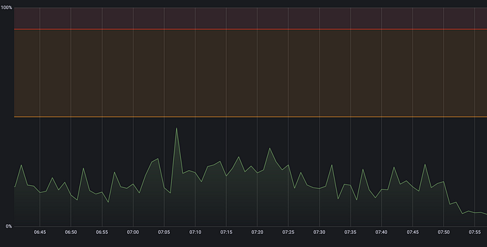
Does your metric have known limits, goals or threshold values to be aware of? Visualize them as horizontal markers on the graph. Classic examples are maximum memory or disk capability, or the error budget. You can also annotate reference numbers such as last week’s average. Similarly, annotate thresholds of alerts that have been defined on that metric or panel. In the following example, you can see the warning threshold annotated in yellow at 50% utilization, and error threshold annotated in red at 80% utilization:
Include the real-time alert status on the top line, so you can spot at first glance if threshold is currently breached without having to inspect the graph. It can be as simple as a thumbs down icon or a broken heart one.
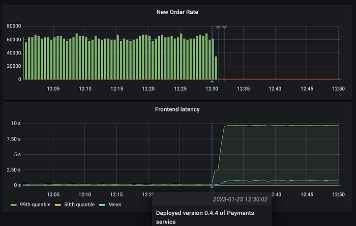
If you can, annotate significant events that occur in the system’s lifecycle, such as configuration change, deployment of a new service version or planned maintenance downtime, as vertical marker lines on the graph. This will help correlate changes in metric behavior with system changes that may have caused them, such as a buggy release or a misconfiguration. In the below dashboard, we see a spike in the frontend latency (and drop in new orders rate), and we can see a marker just before the spike, indicating a new version of the Payments service was deployed.
Overlay values on the same graph only when makes sense
As engineers, we want to be efficient and overlay data on the same graph to ease correlation. But this oftentimes goes against the principle of simplicity and easy UX. If you have 100 instances, plotting their CPU utilization on a single graph can be overwhelming. Avoid plotting too many values on a single graph, to make sure it’s manageable. One useful pattern here is to plot only the “10 highest” CPU consumers.
Even if the number of instances is not so high, but they behave very differently, and therefore have different scales, overlaying them over a single graph will make it quite unreadable. When a single instance is presented in a graph, the Y axis range and scale is calibrated for that specific instance, but when multiple metrics share the same graph, the “noisy” metric will determine the overall graph scale, and we’ll find it difficult to see issues in some other metrics.
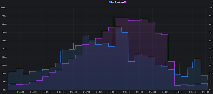
Similarly, consider carefully if it makes sense to overlay different metrics altogether. Plotting request rate, error rate and latency on a single graph will probably make the graph quite difficult to use. Three adjacent graphs for the same time window will probably work better. On some cases, however, it is useful, such as overlaying your Kafka consumer lag and latency, which are naturally highly correlated:
It’s important to note the scale of the graph even when plotting a single metric on it. With a single metric, some relatively minor jitters may visually look big and disturbing, if we don’t pay attention to the scale. Having threshold annotations overlaid as we said above can help put things in perspective.
Endnote
It’s not enough that you have all the data needed, it needs to be accessible and usable so that people can actually understand what goes on and investigate and issues. When designing a dashboard, keep in mind the user experience. Make sure the data is presented in a way that allows users quickly and easily understand what’s going on at a glance. This means ensuring that the dashboard is free of data overload, and that it uses consistent conventions and visual cues to make the data more accessible.
Remember: think like a UX designer, and keep it simple. These guidelines will help you create an effective dashboard that is both intuitive and actionable.
Continue reading the series:


You Might Also Like

Introducing Multiple Shipping Tokens for Logz.io Accounts