Expensive Metrics: Why Your Monitoring Data and Bill Get Out Of Hand
January 3, 2023

This is the second blog in our series on Monitoring Essentials. To learn more, check out these posts on Phantom Metrics and Unreadable Metrics.
We all collect logs, metrics, traces, and possibly other telemetry data. Yet, this can get expensive pretty quickly, especially in today’s cloud-native and microservices-based systems. Why is that? How is it related to the “cardinality problem”? And how can we proactively manage this data surge and keep the associated costs under control?
I decided to delve into this intricate cost challenge in a recent episode of OpenObservability Talks, with the help of my guest Ben Sigelman, co-founder and the GM of Lightstep. Ben architected Google’s own planet-scale metrics and distributed tracing systems (still in production today), and went on to co-create the open-source OpenTracing and OpenTelemetry projects, both part of the Cloud Native Computing Foundation (CNCF).
Cost factor #1: A multitude of microservices
Regardless of whether you’re using a commercial vendor or deploying open source tools, the cost for observability ends up being dominated by the collection and long term storage of the raw data itself, that’s used for observability.
It is quite reasonable to expect that the amount of telemetry data being generated from your application will be proportional to the number of business transactions, which ultimately translates to the amount of revenue that an application is generating. If you were to increase the load on an application by 10X, it’s fair to assume that the amount of data it generates will increase by roughly 10X, broadly speaking.
In microservices based systems, however, there is another significant factor on your data volume, one that people often don’t take into consideration in their preliminary cost assessment. That is the number of services deployed. We need to monitor each service, as well as the interaction between the services, and adding new services inevitably results in extra telemetry data.
The reason that cost has gotten so unwieldy for cloud native is that as the application grows, it increases the top line in terms of application use, and then also increases the number of services that are involved, which drives a surge in the data volumes.
Cost factor #2: High cardinality
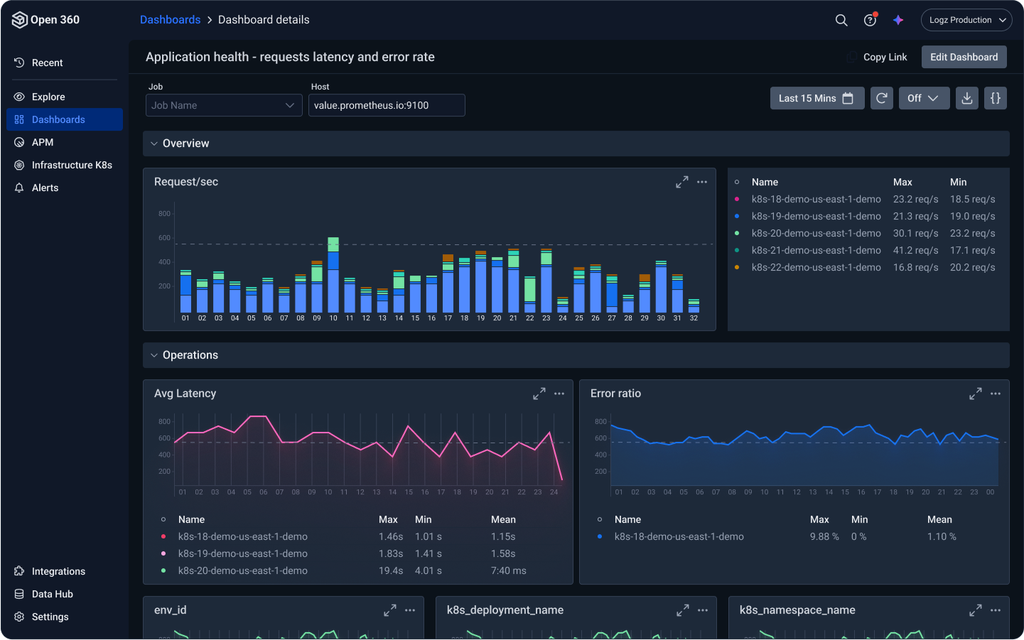
In monolith systems life was simpler, as these systems failed in pretty predictable ways, which helped us determine what we need to monitor, and we built dashboards to capture these known failure modes. The introduction of cloud native systems complicated things. Now I may need to investigate my microservice’s performance per pod, per node, per namespace, per deployment version, and so on. These additional dimensions increase the cardinality of my infrastructure monitoring.
Moreover, unlike infrastructure monitoring, such as CPU, memory and disk utilization, application monitoring is very open-ended, which causes a surge in failure modes. In order to ensure your application’s availability and reliability to your customers, you need to monitor business related metrics, such as the amount of time it takes a user to log into the system or check out with his shopping cart, or similar product observability. With each incident you investigate, you discover a new failure mode you need to track, and after the postmortem developers add metrics or tags to increase observability coverage for these cases.
This is a really slippery slope and a difficult thing for developers to estimate. Developers oftentimes aren’t aware that this well-intentioned action of adding a tag in fact means adding a dimension to the metric, one that each and every time series will be impacted by. This is how dimensions keep building up, which quickly becomes a high cardinality challenge, which ends up extraordinarily expensive. As Ben shared on the podcast:
I talked to economic buyers of metrics tools, where they’ve had single developers add in one line of code, that’s costing them $200,000 a year, steady state of. And that’s totally typical.
Cost factor #3: Wide-range dimensions
It’s not just about the number of dimensions but the size of these dimensions. If the dimension is your number of endpoints, it makes sense. But what if you choose as a dimension your user ID? You can have millions of these in B2C applications. Choosing a dimension with such a wide range of values, or maybe even an open-ended range of values, is an anti-pattern, and can drive your data volume up very quickly. Remember that this is combinatorics of all the different dimensions that determines the total cardinality. Ben said that back in his days at Google they had a few core latency metric for all Gmail use which ended up with 300 million time series values! “That’s why I remember it so clearly, because we had to do a lot of work to support that. We had situations where a single metric wouldn’t even fit in memory in one of the shards of the Monarch system.”
Cost factor #4: Collecting but not using
Interestingly, in many production deployments, many of these tags and labels aren’t actually put to use. In my company Logz.io, when we help our users analyze their metric data costs, we often find between 60%–80% of the metrics that aren’t used anywhere, not in dashboards nor in alerts. Time and time again I see users amazed to discover metric they’ve been collecting but but not using, metrics with dozens of labels that take up storage that eats up their bill.
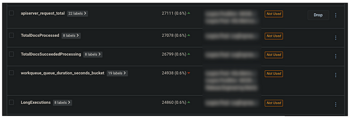
Ben shared a similar experience from Lightstep’s users, where the discovered that only one in 10 metrics is ever queried for any purpose over its entire lifetime. That means 90% of the data is literally never accessed.
How can you determine which metrics you don’t use? Start by mapping the metrics you use in your dashboarding and alerting tool, and compare it with the metrics you collect in your time-series database. If you use Prometheus and Grafana, you can use these Python scripts to extract the metric names. Some observability tools offer metric usage and other data optimization features so you don’t need to map it out yourself.
Endnote
We collect metrics for our monitoring, but it quickly gets unwieldy. It’s the multiplication factor, the combinatorics of many dimensions and high cardinality, that quickly causes data to explode, and the metrics bill to get out of control. It’s not easy for the developer to see the combinatorial impact of adding that one line. You might have several dimensions that seem independently okay, with just a hundred or a thousand values each. But if you add all of those attributes up, the combinatorics of those values can quickly get you way up into the hundreds of thousands, or millions of distinct time series.
Continue reading the series:


You Might Also Like

Application Observability Done Right: Best Practices & Tips