Creating the Perfect Grafana Dashboard
September 4, 2019

For a lot of DevOps engineers and SREs, a Grafana dashboard is often the beginning of a troubleshooting procedure. Grafana is the go-to open source visualization tool for metrics in the DevOps realm right now. It might be an alert in Slack or a colleague pointing out anomalous system behavior. Or maybe it’s just part of your day-to-day monitoring workflow.
Whatever the reason, staring at a beautiful Grafana dashboard is the starting point of what can be either a long and excruciating process, or a short and efficient one. This post will provide a bit of a Grafana tutorial via its guidelines for both strategizing how to visualize your data in Grafana and constructing the panels and dashboards themselves.
More on the subject:
Grafana is a fantastic visualization tool for monitoring time-series data and is renowned for its rich and beautiful dashboards. But as beautiful as these dashboards might be, building them can be a challenge, especially for newbies. One might even call it art. More importantly, how well you build your dashboard can directly affect how long it takes you to identify an issue and come to an actionable conclusion.
Grafana Dashboarding: the Basics
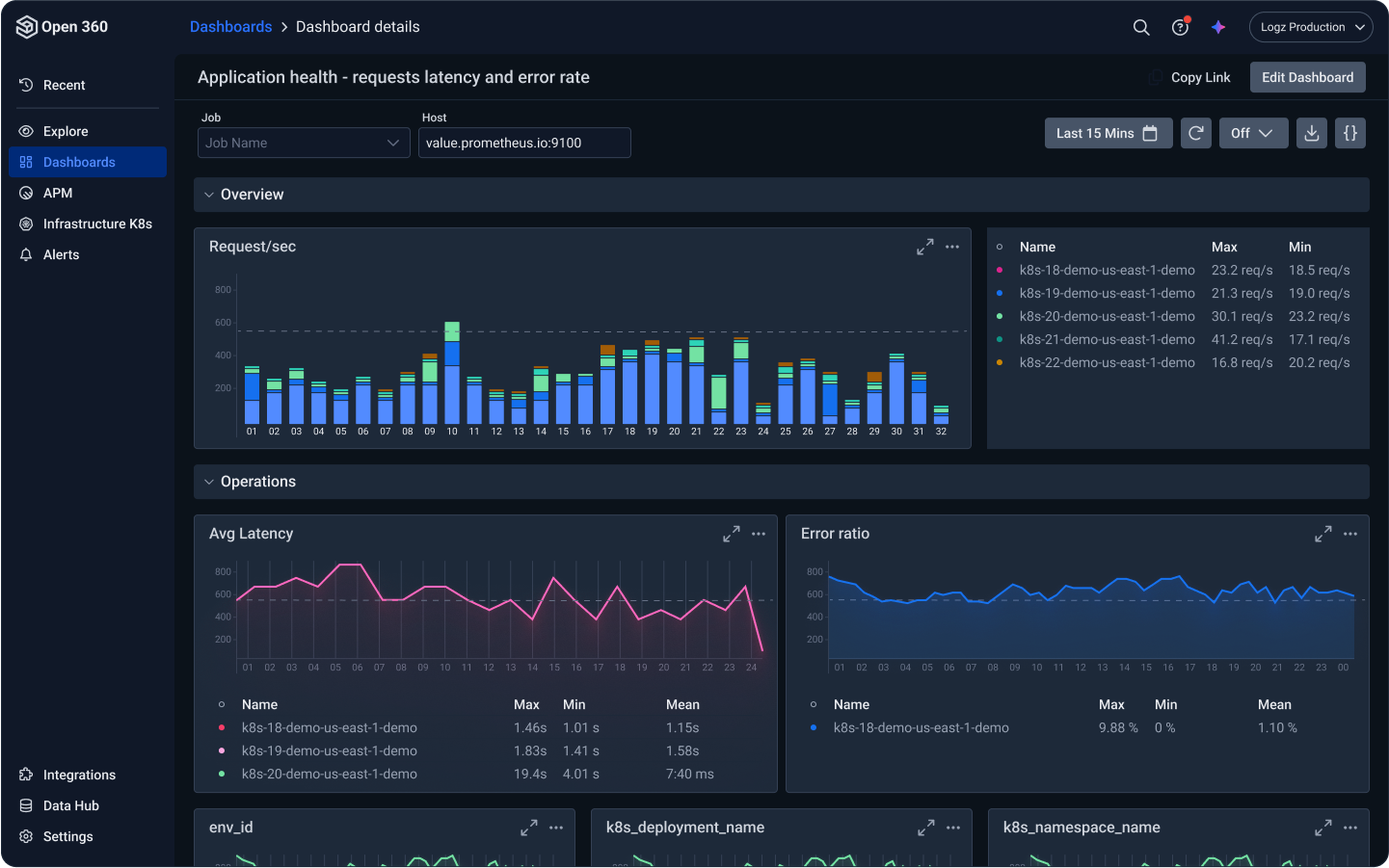
A Grafana dashboard is basically a single view that contains multiple panels (for Kibana users, panels are visualizations) laid out on a grid. Each of the individual panels can be configured to show data from a different data source, allowing you to visualize data from multiple sources within the same dashboard.
The data visualized within a panel is defined using a query editor which is tied to the specific data source used. The look and feel of a panel, and the way your data is displayed in it, is fully customizable, and you can rearrange the panels within a dashboard according to your preferences.
Understand Your Data
A lot of effort is put into building monitoring pipelines. And rightly so. High availability and performance are super important requirements in any monitoring system. But what about the time-series data flowing through these pipelines? Do you know what metrics you are monitoring and how you plan on using them in Grafana?
This might seem like an obvious rule-of-thumb, but the more you know your metrics the easier it will be to visualize and analyze them in Grafana. If it’s custom metrics, you have control. If it’s a system reporting these metrics, most likely there are some specs or docs somewhere detailing the various data available.
Once you gain a better understanding of the different constructs comprising your dataset you’ll have a clearer picture of how you want to use them, or in other words — how you want to visualize your data in Grafana.
This will help you answer two key questions: 1) what panel to use in Grafana, and 2) what metrics to use within the panel. That leads us nicely to the next tip.
Keep It Simple
It’s easy to get carried away when building a new panel in Grafana. You might add another aggregation of another metric or you might start alternating between panel types to see the difference. Before you know it, you’ve forgotten the answer to the question posed in the previous point — what exactly are you trying to monitor?
So, try to keep things as simple as possible.
Ideally, maintain a low metric per panel ratio. If you find yourself looking at a panel visualizing three or more metrics, something has most likely gone wrong along the way and the chances of you interpreting this panel when push comes to shove are slim. The same goes for the number of panels per dashboard. Less is sometimes more, and you probably have better things to do with your time than scrolling down an endless dashboard.
Start Small; Scale Slow
What if you can’t keep it simple? What if you find yourself staring at six different panels visualizing the exact same metric? This can easily happen, especially when monitoring distributed systems, and runs the risk of obfuscating visibility.
If anything else, focus on designing your dashboard around the four golden signals of latency, traffic, errors, and saturation. Yes, each of these signals can quickly explode into multiple panels or even dashboards. I’ve seen dashboards consisting of 12 panels dedicated to each of these signals. What if you had a dashboard with four rows, each consisting of two panels per signal? Remember, you can always scale to more panels if required.
Focus on Readability
When creating a Grafana dashboard, try and think of the teammate across the table. If you take a look at a dashboard or panel you just finished building and can’t understand the story it’s telling, it’s time to go back to the drawing board. But even if you can understand, will your colleague? If you can’t look at a dashboard as a team and infer what’s going right or wrong in the system being monitored, this defeats the purpose of building the dashboard to start with.
There are some simple principles that will help your colleagues interpret your dashboard. Give your panels an understandable name, use proper labeling, set the correct minimum and maximum values in your X and Y axes, use annotations and tooltips to add context to graphs, link to documentation — Grafana has all the functionality needed to make your dashboards readable and usable.
Use Variables (a.k.a., Templating)
Unless you’re using Grafana to monitor a single machine or a single Kubernetes cluster, you’ll most likely find Grafana’s variables feature (formerly known as templating) extremely useful.
Instead of building a dashboard for each server/service/cluster/device you’re monitoring, the variables feature allows you to build one dashboard and then seamlessly switch between monitored objects using dropdown menus.
In more technical terms, variables are simply a placeholder for a value. There are different variable types that you can use, but one of the most commonly used types is the query variable which queries a data source and returns a list of metric names or keys (e.g. device1, device2, device3).
Leverage the Power of Community
There’s no need to reinvent the wheel. We might like to think of ourselves as being unique but there’s a huge chance that another engineer out there has deployed the exact same monitoring stack. What if you didn’t need to build your own Grafana dashboard on your own and could use this engineer’s expertise?
Grafana has a huge community contributing to an endless list of dashboards (and plugins) that can be easily installed and used. This is one of the main reasons why Grafana is so popular to start with. Simply search for the dashboard you’re trying to build and install one of the available, official, and community dashboards. And if you’re in a sharing mood, why not contribute one of your dashboards?
Endnotes
Grafana is truly an amazing visualization tool and can easily be considered best-in-class. Sure, Kibana has done some impressive catching up over the past couple of years with the introduction of Timelion and then Visual Builder, but Grafana still takes the lead if only because of its support for multiple data sources.
While there are some key differences between these two impressive open source visualization tools, they do share some best practices when it comes to the process of dashboarding. Dashboards are a crucial element in monitoring. They can be of huge help to the engineers using them but can also potentially become an obstacle.
Summing it up — less is more, keep your dashboards as readable and simple as possible. Again, it’s easy to get carried away, but remember, you’re not alone.
You Might Also Like

Monitoring Fintech Applications with Logz.io