An Overview of the Essential Observability Metrics
October 12, 2023
Metrics are closely associated with cloud infrastructure monitoring or application performance monitoring – we monitor metrics like infrastructure CPU and request latency to understand how our services are responding to changes in the system, which is a good way to surface new production issues.
As many teams transition to observability, collecting metric data isn’t enough. Observability goes beyond understanding what’s happening to our system – it also helps us diagnose system behavior so we can more effectively investigate the root cause of issues.
This blog will focus on the critical observability metrics applicable to nearly anyone concerned with application performance and reliability. We’ll also discuss how to incorporate other relevant telemetry data to troubleshoot issues after surfacing them with our metrics.
We’ll be using the Logz.io Open 360™ Observability Platform in this example to collect and visualize our observability metrics, while optimizing the data for cost reduction.
Regarding observability metrics, we’re going to focus on the four golden signals, which include latency, saturation, traffic, and errors. Below are some examples of each:
- Latency: The average amount of time per minute it takes for a service to respond to a request.
- Saturation: the amount of resource capacity within your infrastructure, like CPU or memory.
- Traffic: The amount of active users in a system or the average request rate per minute for a given service.
- Errors: The amount of errors generated by your front-end service(s).
Let’s discuss collecting and visualizing these metrics for infrastructure and applications in a cloud-native environment. We’ll dig deeper into the power of data correlation and observability, which can help us respond to our metrics more effectively.
Collecting infrastructure and application telemetry data
Before we begin visualizing and analyzing our observability metrics, we need to collect them. If you want to jump straight to analyzing the metrics themselves, you can skip this section.
In this example, we’re going to use Logz.io’s Telemetry Collector – an agent based on OpenTelemetry – to send metrics to Logz.io for storage and analysis. We’ll be collecting metrics from an app built with Java and Go running on Kubernetes.
First, login to your Logz.io account (or get started for free) and find the ‘Send your data’ page. From there, hit the ‘Go to the Telemetry Collector’ option.

Now, choose the platform you want to monitor – in this case, we’re going to choose EKS.

After selecting a platform, determine where you’ll be running the script (we’re going to use Helm), and then copy that script. Now, we can paste and run the script into our terminal, which will deploy the Telemetry Collector across our cluster and begin streaming live metric and log data to Logz.io.

After deploying your Telemetry Collector agent, you’ll begin seeing logs and metrics streaming into your Logz.io account.

The four golden signals for infrastructure observability metrics
Now that we’ve set up our data streams, we can begin analyzing our observability metrics to better understand the health, performance, and reliability of our system.
To do this, we’ll rely on Logz.io’s Kubernetes 360, which surfaces the four golden signals in our metric data, along with many other interesting insights that indicate the status of our infrastructure.
We don’t need to build any dashboards or set up any correlation – Kubernetes 360 automatically collects the most critical performance data for our infrastructure, displays these metrics on visualizations, and correlates logs, metrics, and traces for quick root cause analysis.
After opening up Kubernetes 360, we can see a complete picture of our performance per deployment, which includes a summary of failed pods, CPU, memory, pod restarts, and errors rates for each deployment. This provides a quick and easy glance at production health.

If we prefer, we can also view this data per pod, per node, per Job, per DaemonSet, or per StatefulSet. We can further slice and dice the data with the filters on the left so that we can explore the services most relevant to us and dig into interesting trends.
Let’s dive deeper into the specific observability metrics per pod by navigating across the tabs at the bottom of the screen. We’ll start with ‘status,’ which shows us the uptime of each pod, as well as the amount of failed pods at that moment.

Uptime is looking good. Next we can look at CPU and memory, which represent the ‘saturation’ of our infrastructure – one of our four golden signals.
CPU view:

Memory view:

While we have plenty of CPU in our infrastructure, it looks like memory is high for a few pods, which is something we can investigate further after checking out some more of our observability metrics. Let’s continue across the tabs to analyze another golden signal for our infrastructure reliability: error rates.

Error rates are looking acceptable with the exception of our ingress-nginx-controller service, which is something to keep an eye on.
Finally, let’s check out our pod restarts – a critical indicator for service health in Kubernetes environments.

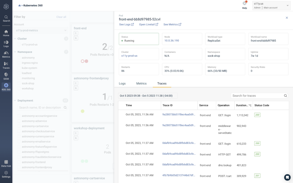
It looks like our front-end service, email service, and load generator service are all struggling. Since we also saw high memory for our front-end service, let’s click on one of those pods to gather more insights about its current state.

After clicking on a pod, we can immediately see more data that provides additional context around its performance, including its status and other metrics we already reviewed.
To begin investigating what could be causing the high memory and restart rates, we can begin looking at the logs generated by this specific pod in the screenshot below.
This is an example of data correlation, which makes it easier to quickly diagnose system behavior after surfacing a potential issue, like we’ve done here. While the observability metrics alerted us that this pod could be struggling, correlation with logs and traces can help us quickly understand what is causing the issue.

We ran a quick search for errors, but the data doesn’t look too concerning. As we pivot over to the metrics tab, we can see some of the same metrics as we did before. However, before we could only see the current status of the metrics, with this view, we can see the metric measurements over time.

We’ve already seen metrics like CPU, memory, status, and restarts, but the traffic bytes and packets are new, which covers our third golden signal: traffic. None of these metrics look very troubling, let’s move on to our trace data.
In the Traces tab, we can see specific spans generated by the pod and filter them by status code or duration. By hitting ‘Duration,’ we can see all of the operations completed by the pod ranked by the length of time it took to complete.
And with that, we’ve analyzed all four golden signals within our infrastructure metrics! CPU and memory for saturation, traffic bytes and packets for traffic, errors rates for errors, and operation duration for latency – plus some bonus metrics that can provide more context, like restart rates and failed pods.
Notably, we didn’t even need to build anything ourselves to get these insights. Kubernetes 360 provided them for us.
Let’s move onto the application layer.
The four golden signals for application observability metrics
In the previous section, we saw how Kubernetes 360 automatically highlighted the essential observability metrics within our infrastructure to help us quickly understand the current state of our system health and performance.
Now, we’ll do the same thing for our application metrics using Logz.io’s Service Overview.
By hitting the ‘traces’ tab on the left menu and navigating to ‘Services,’ we can see a list of our services, along with high-level performance metrics for each service.

Just like our infrastructure view, the metrics data from our front-end isn’t showing anything dire, but they warrant investigation, so let’s do it.
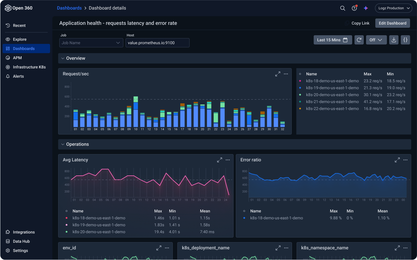
After clicking on the ‘front-end’ service, we get to the Service Overview page, which shows us a deeper look into the service performance over time.

We can actually see all four golden signals in this view alone – the ‘request rate’ visual shows traffic, the ‘latency’ visual obviously shows latency, same with the error ratio, and the CPU and Memory metrics in the bottom right show saturation.
Like Kubernetes 360, Service Overview is recognizing and highlighting this data automatically, so we don’t have to build out any dashboards ourselves.
By scrolling down, we can see the logs generated by this service.

To focus on the errors, we simply organized our logs by ‘Log level,’ and selected the ‘ERROR’ filter in the graph. While there isn’t anything of concern in this data, it’s easy to imagine how quickly we can begin debugging an issue after surfacing it in the metrics above.
That’s what observability is all about. It helps us quickly answer questions such as, “What’s causing this sudden latency in my front-end service?”
As we scroll back up, we can see a list of every operation executed by the front-end service, along with key observability metrics for each one.
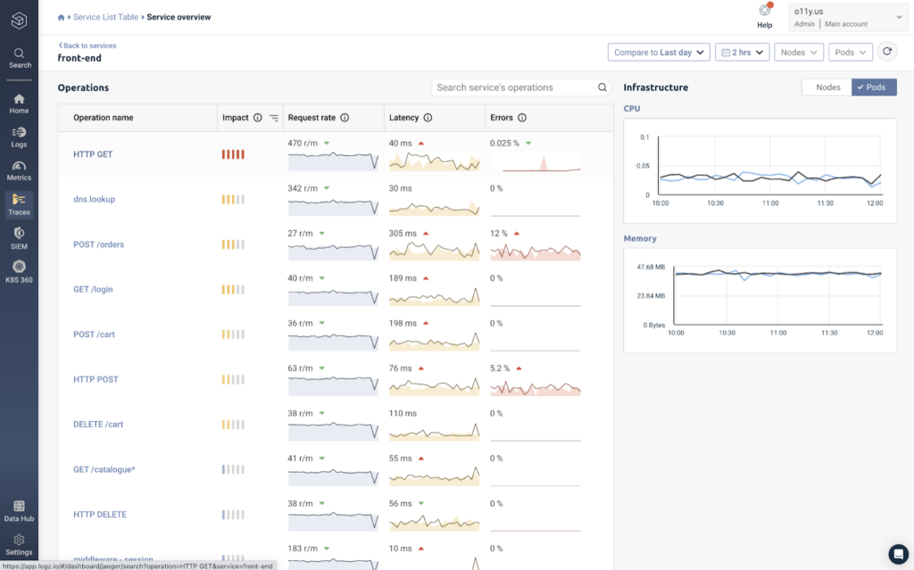
While this gives us a deeper layer of visibility within our services, analyzing these metrics in isolation isn’t all that helpful since we can’t see how it interacts with other services. To gather this context within the entire application request, we can click on an operation – let’s choose the HTTP GET operation at the top.
In the screenshot below, we can see the full stack trace, which displays the latency of each operation that makes up the entire application request, allowing us to quickly spot latency and the root cause of issues.

Our HTTP GET operation is right in the middle, and shows relatively low latency compared to operations around it. The ‘!’ represents an error that’s tagged to the span. After opening it up, we can see an exception message that occurred during this request.

This example shows why it’s not enough to simply collect observability metrics. While they are extremely helpful for spotting issues, we need additional data and context to diagnose the root cause of the problem. With data correlation, we can do that in seconds.
Getting started with your metrics
In these examples, we reviewed how to collect, monitor, and correlate observability metrics using Logz.io. Specifically, we used Kubernetes 360 and Service Overview to automatically highlight the most important metrics – including the four golden signals – so that we didn’t have to build any dashboards ourselves.
If you’re looking for a simple and cost effective way to monitor observability metrics and correlate them with logs and traces, learn more about Logz.io’s observability platform to see whether it works for you.
You Might Also Like

A Guide to Enterprise Observability Strategy