A Kibana Tutorial – Part 2: Creating Visualizations
April 3, 2018

In part 1 of this series, we described how to get started with Kibana — installing the software and using various searches to analyze data. In this part, we will outline the next natural step in using Kibana — visualizing your log data.
Who doesn’t like a beautiful Kibana dashboard?
There’s something visually appealing about different charts and graphs depicting your data in real time. Whether a simple pie chart or a more complex Timelion visualization, being able to slice and dice your data is one of the reasons I love using Kibana.
Truth is, though, before you reach the stage where you’re gazing upon a beautiful Kibana dashboard there are some necessary steps that you need to go through. Kibana super-users might be able to glide through these steps with ease, but most users can and will find it challenging. Experience is important as well as intimate knowledge of your log data.
This tutorial will hopefully help those of you stuck on your first or second visualization understand a bit more on how to visualize data in Kibana.
General Kibana Best Practices
Logs come in all sorts and shapes, and each environment is different. This makes it quite challenging to provide rules of thumb when it comes to creating visualization in Kibana. Still, there are some general best practices that can be outlined that will help make the work easier.
Structure your logs
Kibana visualizations are based on the fields constructing your logs. The more structured and consistent your data is, the easier it is to parse them and later on build visualizations. If you’re shipping a common log type, your data will most likely be structured and formatted in a standardized way. Application logs, for example, will require more discipline and thinking from the developers (read more about application logging).
Explore and understand your data
Understanding your data is key to an easier visualization. If you know, for example, that the field response_code is mapped as a string and not an integer, you will know that you cannot use metric aggregations with it in visualizations.
This understanding is often gained by setting up parsing but if this was performed by a colleague or automatically (if you’re a Logz.io user), exploring the data is up to you. Play around with queries and searches, do some research on the fields, take a look at their type and value.
Defining your goal
Once you have a clearer understanding of your data, you can begin to strategize your visualizations. Start by defining a goal by asking yourself a simple question — what are you trying to analyze or monitor?
Are you looking for a historical trend over time for a specific field? Do you want to see a simple breakdown of the top ten values for a specific field? If you are monitoring traffic to your website, do you want to see a geographical depiction of where the originating request is coming from?
Answering this question provides you with pieces of information required for the next step — what fields you are going to use, what visualization type is best suited, and of course what log type is going to be used (in case you’re shipping multiple types).
Keep it simple
You don’t have to start with a fancy Timelion visualization. Start simple and expand from there. If it’s a pie chart visualization for example, use the basic default settings to see a breakdown of the top five results for a specific field.
Try and avoid overcomplicating your visualizations. The desire to see it all in one place is understandable, but it makes no sense to crowd up a perfectly constructed visualization with a sub aggregation of an irrelevant field.
Understanding Kibana Aggregations
Kibana visualizations are based on aggregations performed by Elasticsearch. Kibana simply supplies the UI to use these aggregations for defining the different dimensions on display in visualizations.
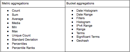
There are two types of aggregations — Metric aggregations and Bucket aggregations. Bucket aggregations groups documents together in one bucket according to your logic and requirements, while the Metric aggregations are used to calculate a value for each bucket based on the documents inside the bucket.
Each visualization type presents buckets and their values in different ways. So in a pie chart for example, the number of slices is defined by the Buckets aggregation while the size of the slice is defined by the Metric aggregation.

Kibana supports quite a large number of Elasticsearch aggregation types, each with specific configuration options and field type limitations.
Histogram and Date Histogram Bucket aggregations, for example, will only work on integers. The Min and Max Metric aggregations will only work on number or date fields while the Unique Count Metric aggregation works on any field type.
It’s worth doing some research on the different aggregation types and their usage methods before you proceed.
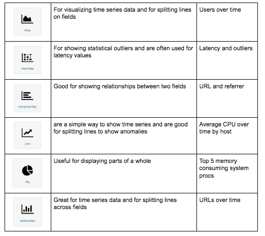
Kibana Visualization Types
Kibana’s visualization options are rich and varied and one of the reasons why users love the ELK Stack. Sometimes though, too much choice can actually complicate matters.

If you adhere to the best practices outlined above, you should be able to discern which specific visualization type you are going to use. If not, below is a brief description on each type and what it can be used for.
Visualizations in Kibana are categorized into five different types of visualizations:
Basic Charts
Data
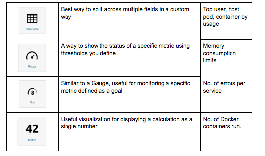
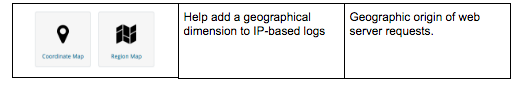
Maps
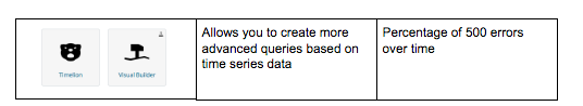
Time Series
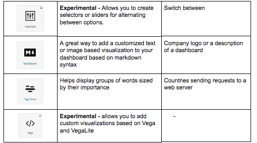
Other
Creating a New Kibana visualization
It’s time to start building your first visualization.
The challenge here is that each visualization type is different. Each has different configuration options and each involves different building steps. Still, there are some basic common steps that can be described, which I will do by providing an example.
In the example below, I will be visualizing Docker performance metrics extracted from my test environment. I will be building a Vertical Bar chart that will give me a breakdown of the number of Docker daemon events collected by the Logz.io Docker Log Collector.
To create a new Kibana visualization, select Visualize in the menu on the left, click the + icon and then select the visualization you want to create.
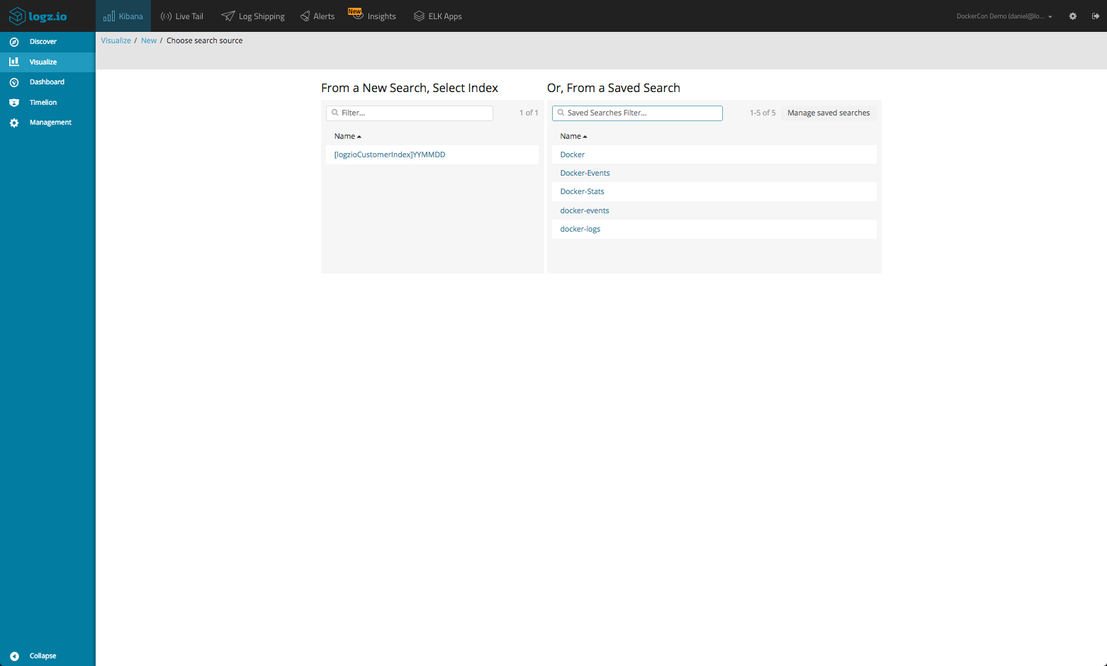
You are then presented with a choice — either create the new visualization on one of the indices you have in Elasticsearch or a saved search. Choosing the latter is useful if you know exactly what subset of log data you want to visualize and you have a saved query to show for it. In this case, I will select the entire data set as the basis for my new visualization.
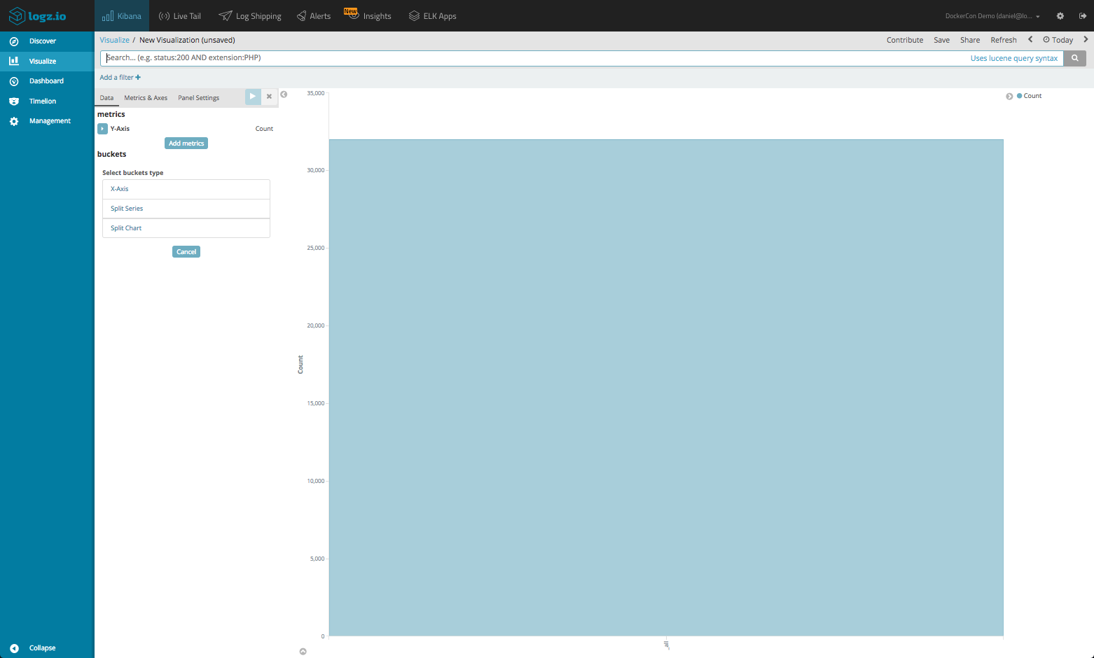
Depending on the type, visualizations will have different configuration panes. The basic charts (see Visualization Types above) have three different panels: Data, Metrics & Axes and Panel Settings, while the other types only have Data and Options. The Data panel is where the most important configuration settings are performed and this is the panel displayed when opening a visualization.
By default, the Metrics aggregation on display is Count with no Bucket aggregation, so what I’m seeing is one bar displaying the total amount of Docker daemon events recorded in the time frame selected at the top-right corner of the page.
Let’s start tweaking this visualization.
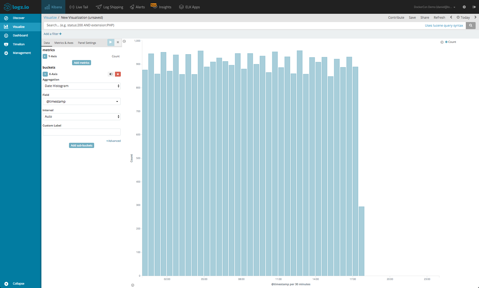
The Count Metric aggregation, which is actually my Y Axis, will suffice so I will leave it as-is, but I want to see the number of daemon events taking place over time for a set interval. To do this, I need to configure my Bucket aggregations.
I will start by defining an X Axis that uses a Date Histogram Bucket aggregation of the @timestamp field. I can set the interval myself, but for the purpose of this tutorial will use the automatic interval.
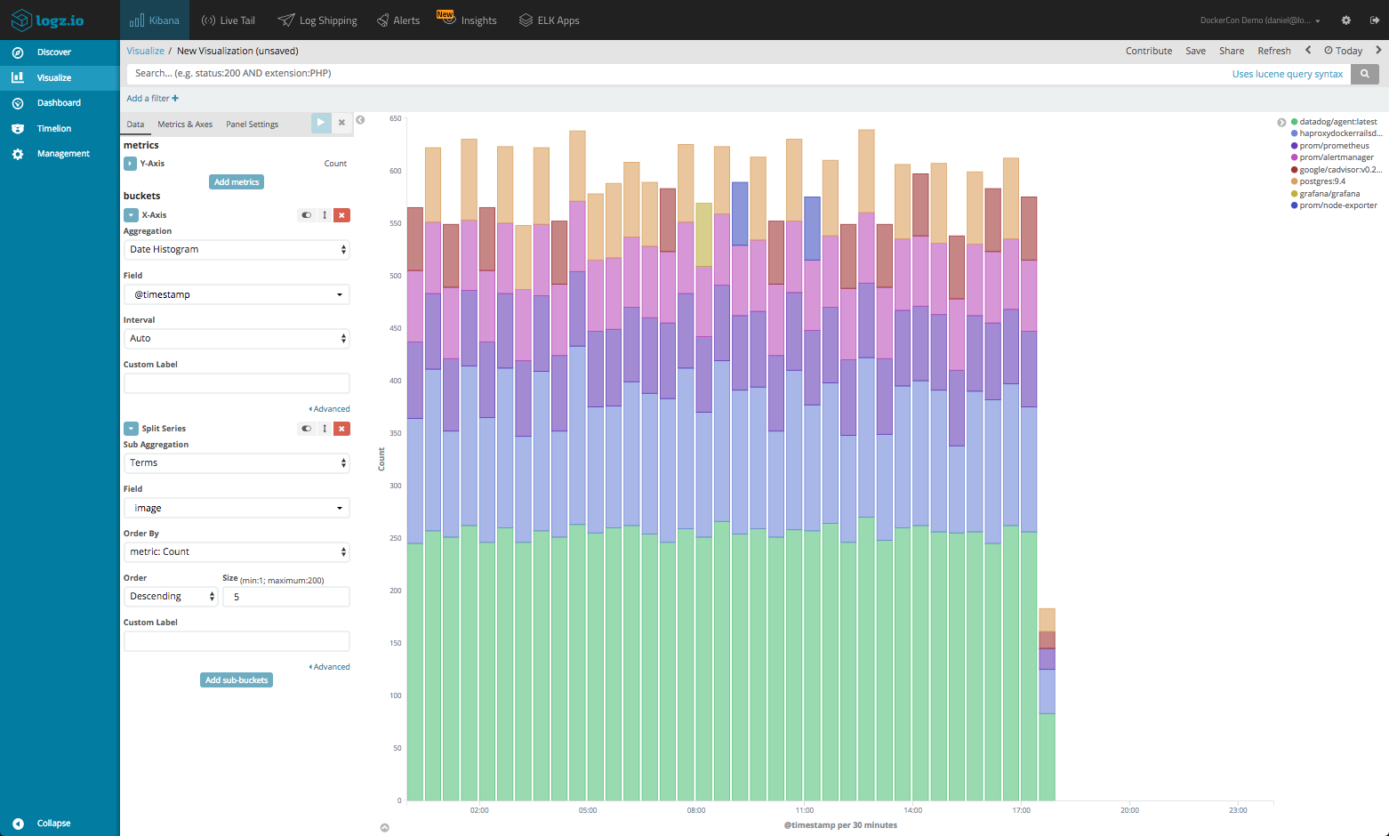
Now, this is nice but still not enough. I want to see a breakdown of the daemon events per Docker image. To do this, I will define a Terms sub-bucket aggregation using the image field (for the container image name).
Like I mentioned above, there are additional configuration options that can be used to tweak the appearance and display of the data. For the basic charts, for example, we can easily switch between line/bar/area charts using the Metrics & Axis panel.
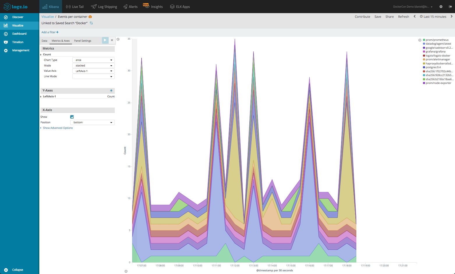
In the Panel Setting Panel, or the Options panel in other visualization types, we can play around with the legend position and other apply other visual optimizations.
Don’t forget to save the visualization when done!
You can at any stage edit a visualization so nothing is set in stone. Open an existing visualization by repeating the process at the beginning of this section, and simply select the visualization from the list. From a dashboard in Edit Mode, you can click the small edit icon for a single visualization. This will also open the visualization for editing.
Sharing Kibana Visualizations
I’ll end this post with some methods for spreading the goodness of your visualizations to other team mates, after all — what’s a beautiful visualization worth if you can’t brag about it?
Sharing saved visualizations/snapshots
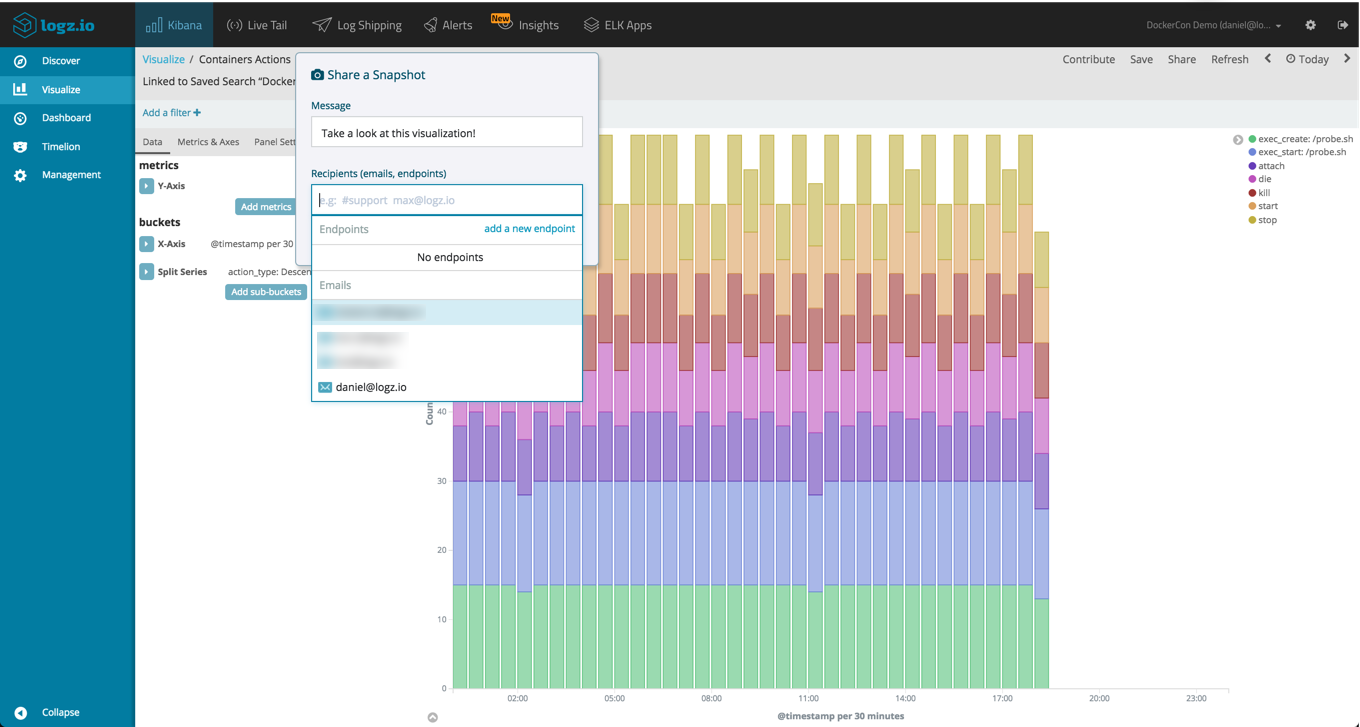
Clicking the Share button at the top of Kibana provides you with various URLs that you can use to share your visualization with the outside world.
There are two main options — you can either share the most recent version of a saved visualization or a snapshot of the current state of the visualization. In the case of the former, those shared with be able to see recent edits made where as in the case of the latter recent edits will not be visible.
In both cases, there are two sharing URLs that can be used — embed snippets for embedding the visualization on a web page or a link URL to view the visualization with other Kibana users (clients will need access to Kibana for these URLs to work).
If you are using Logz.io, you will also be provided with a third option — a public URL for sharing the visualization with the entire world using user tokens and filters.
Exporting/importing
Kibana visualization configurations can be exported and imported as JSON files. This is useful mainly for recreating a Kibana object (visualizations are often referred to as objects, together with saved searches and dashboards) in another ELK deployment instead of building the object from scratch.
Under Management → Saved Objects in Kibana, you will see a list of all the different objects you have created and saved. Simply select one from the list and click Export. Clicking Import allows you to import an object into Kibana.
Logz.io Snapshots
Sharing a URL to the actual object in Kibana is super-useful, but sometimes you want to quickly point out an interesting event or trend with a colleague. Logz.io Snapshots is one of the add-on features developed by Logz.io that allows you to easily share an image of a visualization or dashboard, directly from Kibana, to Slack, an email address or another endpoint of your choice.
Summing it up
Visualizing data in Kibana is one of the more enjoyable parts of using the ELK Stack but it is also not a trivial one. This article showed one example of creating a visualization, but remember — there are now 18 different types of visualizations available for use in Kibana, some not as easy to use as the basic charts.
The good news is that unless you are analyzing custom logs, there is a good chance someone else has already created a visualization for you. Search on GitHub, or better yet, if you’re a Logz.io user you can make use of ELK Apps, a free library of pre-made Kibana visualizations and dashboards for different log types.
To sum up my advice for creating visualizations in Kibana:
- Own your logs – familiarize yourself with the data, understand the field types and their values.
- Research – learn about Elasticsearch aggregations, a key concept that will help you understand the options you have to slice and dice the data in Kibana
- Get your hands dirty – do not be afraid to explore. At the end of the day, it’s all about trial and error. Play around with the different visualizations, make a mess.
And the main thing – try and enjoy yourselves. Kibana is an awesome visualization tool that will help you stay on top of your logs, in a good way that is!
You Might Also Like
Tool Consolidation Is Dead. Long Live Agentic AI.