Launching the Community COVID-19 Dashboard Project
March 29, 2020

Let Data Shed Some Light in the Midst of Uncertainty
The burden the COVID-19 novel coronavirus has placed on the world is enormous. There’s a great thirst for information and clarity. So, we at Logz.io have decided to offer a Community COVID-19 Dashboard Project, so that everyone can better understand how the outbreak impacts the world and their region. We see that as a community effort. We invite the global community of engineers and data scientists to add data to this public dashboard that will cover not just the direct impact of the coronavirus on public health, but other aspects of society as well. We want to help everyone better understand the impact of COVID-19 anywhere around the world.
Collaboration in the Time of Coronavirus
With the world connected like never before, cross-border collaboration has never been possible at this scale. The developer community can use its skills to clarify an obscure picture, based on open-source software and crowdsourced data. We’ve started by using John Hopkin University CSSE’s amazing public dataset, which aggregates multiple public data sources including the World Health Organization, multiple Centers for Disease Control and Prevention (CDC) around the world, state and national government health departments, and more. What you can currently see on the dashboard reflects their extensive data.
But this is just the beginning. Our vision is that the community will share and translate additional public data sources, pool information, filter it and make it accessible to people worldwide through a dashboard of easily readable charts, graphs, and visualizations.
The opportunity here is to delve deeper and paint a broader picture than the basic numbers. Through this information, we hope to create a virtual data hub for problem-solving and optimism more readily available to professionals and citizens globally.
Gaining Better Understanding of Pandemic Status
In the initial phase, based on the above JHU CSSE data source, we have information about the number of COVID-19 Confirmed Cases and Deaths around the world. For some countries, we also have additional information about Active Cases and Recovered Cases. However, JHU has stopped providing the latest Active and Recovered cases data for several countries, most notably the US, due to difficulties finding a reliable source for this information at the county level. Fortunately, the rest of the JHU data continues to be updated.
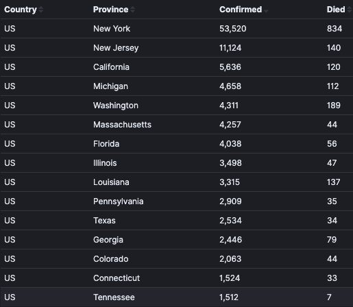
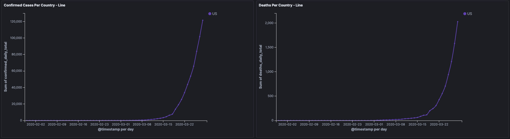
With that information at hand, you can easily see in the dashboard the global status of the pandemic around the world in a nutshell, as well as go deeper into it with map view, trends over time or comparisons:


Community COVID-19 Dashboard Project: cases per country

Interested in the status in your own country? Just select it and the dashboard will zoom in there. For certain countries, we have included state-by-state or province-by-province data:
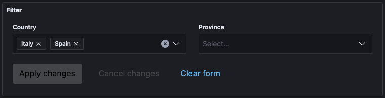
Do you want to see how your country is doing in comparison to another country? Just choose and compare:


Monitoring COVID-19’s Wider Impact
We’ve started with the basic health related data. With the help of the community, we aspire to enrich it with health and medical information on symptoms, vaccination, treatments, and more. The value of this latter data comes in providing not just organized optimistic information about the coronavirus, but also a place where people can get a clear picture of the global race for a cure (without the deluge of unclear or misleading information being posted across the web).
Health-related data is just one facet. In addition, we wish to add diverse data covering the wider impact of COVID-19 on daily life, such as:
- The Economy (exchanges, specific significant stocks, oil prices, unemployment data by country/state/province, etc.),
- Air Travel (monitoring where travel is still happening and the rate of cancellations),
- Environment (air pollution reduction from people staying home),
- Internet demand (app downloads, broadband usage, mobile data), and more.
Our vision is that this information will show how the world’s infrastructure and culture is coping with the pandemic.
Check Out the COVID-19 Dashboard—Get Involved!
The world is looking for clarity and knowledge. So if we can help provide those insights, the COVID-19 Dashboard will be an important resource to anyone looking for real-time information on the pandemic and its predicted after-effects. So go right in and start delving into the data in the dashboard.
Have you got some interesting dataset to contribute, some useful analytics to suggest on top of the existing dataset? Go ahead and contact us at community@logz.io.
Together we can use data to shed some light in the midst of the uncertainty of COVID-19.
Read about Logz.io’s response to the COVID-19 pandemic, including our Supplier Support Plan.
You Might Also Like

Accelerating Log Management with Logging as a Service