Logz.io Infrastructure Monitoring: Building Visualizations in Dashboards
March 18, 2021
In a previous post I explained how to send metrics to Logz.io Infrastructure monitoring with Prometheus—now let’s analyze them by building Prometheus dashboards and visualizations in our metrics UI!
Once you’ve started to send metric data to Logz.io, how do you visualize and interpret that data so that it’s useful for you? Logz.io Infrastructure Monitoring provides powerful querying and visualization of your data.
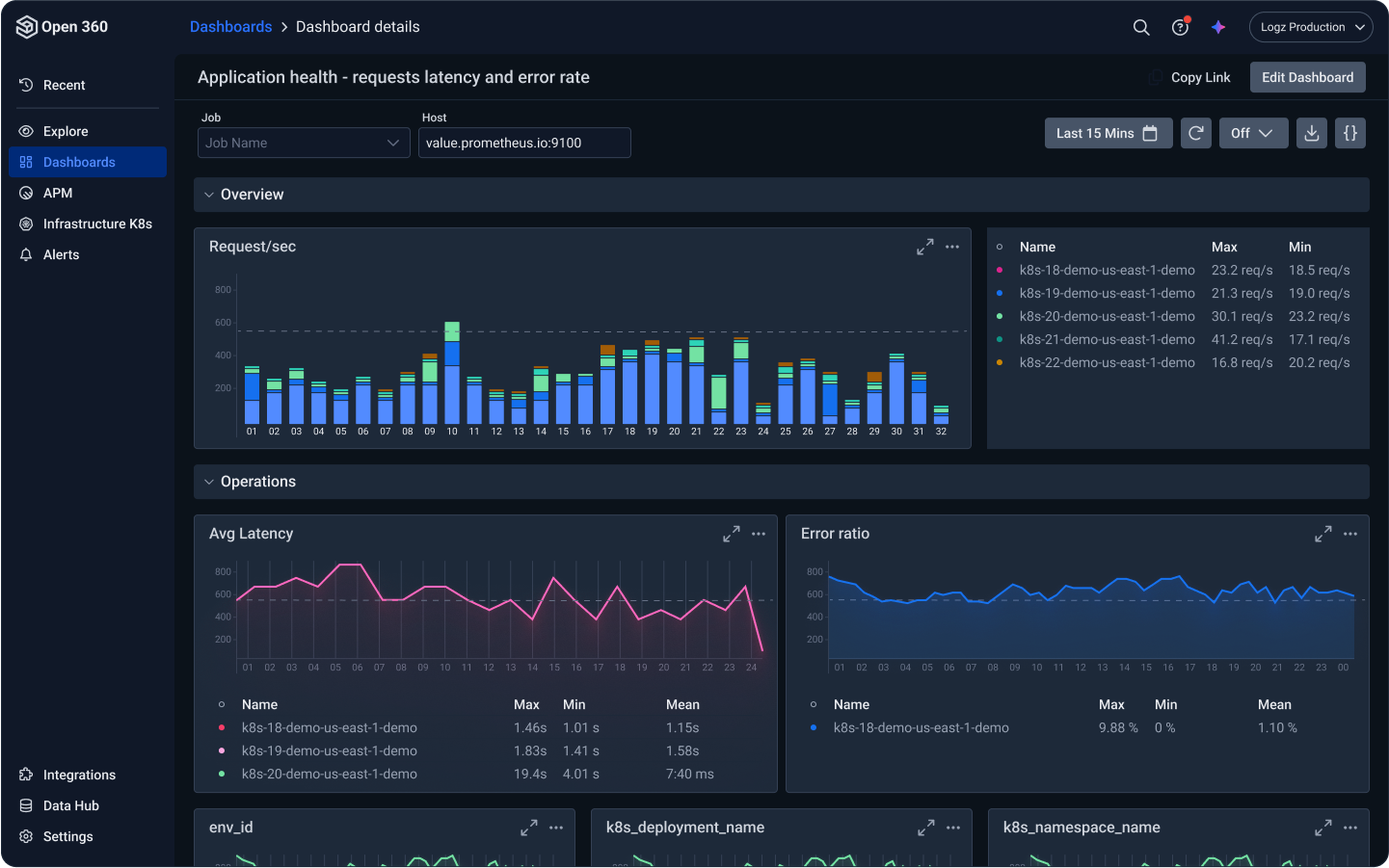
The dashboard is the heart of infrastructure monitoring. Logz.io’s Metrics UI offers a rich set of capabilities for creating custom panels and dashboards, which I will show later in this article. But the easiest way to start is with existing dashboards, whether ones you wish to migrate with you or pre-built Prometheus dashboards in Logz.io.
Start Easy with Ready-Made Prometheus Dashboards
Logz.io offers a growing list of useful pre-built dashboards which you can duplicate to create your own Prometheus dashboards, or just review to take ideas for specific panels or copy useful snippets. You can find pre-built dashboards for AWS cloud services, SQL and NoSQL databases (such as Mysql, Postgres, and MongoDB), operating systems, Docker monitoring, and Kubernetes monitoring in container environments.
Have you got a Grafana dashboard you’d like to use?
You can easily export these dashboards from Grafana to a JSON format and then import them into Logz.io.
To manually import such a dashboard, go to your dashboards management page (Dashboards → Manage), and click the “Import” button.

You can upload the dashboard’s JSON as a file or just paste the JSON snippet in the editor, then hit “Load”, and voila – your dashboard is in your Logz.io Metrics account. You may need to adjust your datasource, in case it was hard-coded in your original dashboard.
If you have many dashboards you wish to import, check out this Python tool that can import a bulk of dashboards. The tool will also take care of adjustments such as the datasource.
You can find more information on manual and bulk imports here.
What if you don’t have the dashboard you need?
Logz.io Prometheus-as-a-Service and Infrastructure Monitoring facilitate visually creating custom dashboards.
Building Custom Dashboards for Prometheus
Dashboards are most powerful when you can filter metrics based on relevant variables, so you can zoom in on your topic of investigation. Before starting to create your dashboard’s panels, it’s best you put some thought into which variables are relevant in your environment, and add them to your dashboard (although of course you can add or edit variables also later on). It can be found under Dashboard Settings (the cogwheel ⚙️) → Variables:
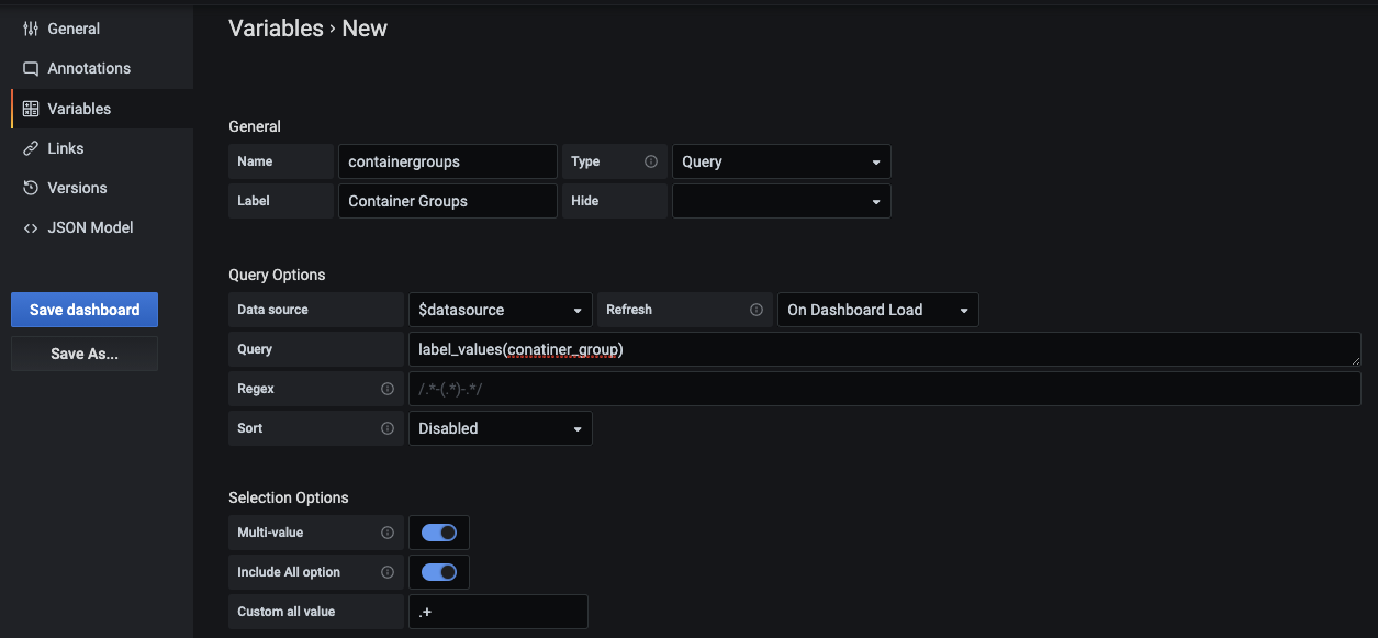
Start by defining your variable through a query. To do this, familiarize yourself with the syntax and templating capabilities. You can also create nested variables, enabling you to fine-tune your investigation gradually. For instance, in a clustered environment you may first hone in on a cluster, and then on a specific node in that cluster.
Once defined, the variables will present at the top of your dashboard as drop-down selection. You can now parameterize panels based on these variables using the $<variable-name> notation.
Now it’s time to add your panels of interest. You will find many available panel visualizations you can use, which are highly customizable:

PromQL Queries in Panels
The heart of the panel is the query. Here you will define the datasource (your Logz.io metrics account) and a PromQL query defining the metrics of interest. You can use the variables you’ve defined as parameters, as seen in the example below:
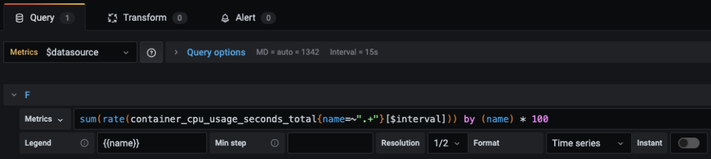
Logz.io Infrastructure Monitoring Visualization
There are many more capabilities for writing complex queries (even from multiple sources!) in panels, and for creating simple and powerful visualizations. If you find something interesting in your panel and would like to analyze the data further, you can switch to the Explore view with one click. Check out this post on how to link your metrics with your logs, how to add Markers, and how to define alerts.
You Might Also Like

Instrumentation for C# .NET Apps with OpenTelemetry