A User Guide for OpenSearch Dashboards
June 22, 2023

Over the last decade, log management has been largely dominated by the ELK Stack – a once-open source tool set that collects, processes, stores and analyzes log data. The ‘k’ in the ELK Stack represents Kibana, which is the component engineers use to query and visualize their log data stored in Elasticsearch.
Sadly, in January 2021, Elastic decided to close source the ELK Stack, and as a result, OpenSearch was launched by AWS as an open source replacement.
The Kibana equivalent for OpenSearch is the creatively-named “OpenSearch Dashboards,” which at the moment, closely resembles Kibana. As the AWS and OpenSearch community take OpenSearch Dashboards in a different direction than Kibana, the two projects will look more and more different.
For the purposes of this guide, we’re going to demonstrate key OpenSearch Dashboards functions via Logz.io, which will show the exact functionality of OpenSearch Dashboards plus some extra capabilities at the end. Logz.io offers a faster and easier way to scale log management with OpenSearch, while unifying log data with metric and trace analytics.
We’re assuming you already have an OpenSearch stack up and running so we can show you how to analyze your logs with OpenSearch Dashboards. If you don’t, check out our OpenSearch installation tutorial.
How to Prepare for Productive Log Analysis
There are two things you should do before you can productively analyze your logs.
First, you need to get them parsed. Log parsing transforms a useless scramble of information into log files with fields and values you can search. Without proper log parsing, you can’t expect to search your logs quickly or easily.
For log parsing tools, you can use log data collections technologies like Fluent or FluentBit, or services like Logz.io’s parsing-as-a-service, which parses your logs for you.
Second, after you’ve parsed your logs, familiarize yourself with the data. Specifically, open up different kinds of logs and explore their fields to learn what kind of information your logs contain – this way, you’ll know what to look for as you’re building queries and visualizations.
After that, you’re ready to begin analyzing!
Building Log Queries with OpenSearch Dashboards
Before building and editing queries to narrow down your data, it’s usually best to establish your time frame first. Since querying data over longer periods of time can strain your cluster resources, it’s best practice to narrow your investigation to the smallest acceptable timeframe before building your queries. Of course, for basic queries, it won’t matter all that much.
To establish the time frame of your search, simply go to the top right corner, and hit the ‘Quick Select’ option, which has prebuilt time frames you can select.

To the right, you can select the spelled out time frame to get more specific. You can choose to look at logs in the last X minutes, or choose a time frame from XX:XX:XX time go to XX:XX:XX time ago.

Once you have your timeframe set, the easiest way to query your log data is with search filters, which allows users to easily search values across different fields. For example, if I wanted to pull up my error logs, I could hit ‘Add filter’, select the ‘log_level’ field, and choose the ‘ERROR’ option.

As a result, I can see all of my error logs in one place. Naturally, my next question may be to figure out which services these errors are coming from.
To do this, I can simply open up one of the error log files and scroll down to the ‘type’ field, which is the field that specifies which service generated the log (this is where familiarizing yourself with the data becomes handy).

It looks like this error was generated by my sock-shop-carts-db service. To better understand the makeup of errors across my services, I can hit the ‘Toggle column in table’ button, which appears as I hover my cursor over each field.
As you can see below, this adds a new column to the right of the table, which shows the service that generated each error log.

Most OpenSearch Dashboards users prefer to use search filters because they offer a fast and easy way to navigate your logs. If we want to build more advanced queries, we can use the Dashboard Query language (DQL).
DQL is a simple query language that lets users search for specific values within log fields – just like adding a search filter. The format is simply [field]:[value]
In the top left of the screenshot below, you can see that “log_level:error” will show us all our error logs in the last 15 hours. Now let’s narrow our search to specific services, which will require a Boolean operator. DQL supports not, and, or or operators (which are applied in that logical order).
To specify that I want to see all my error logs from my front-end service, let’s add ‘AND type:sock-shop-frontend’ to my query.

This narrows down my logs so I can see the most relevant information. To add additional services to our query, we can add additional log types and group them together with parentheses using an OR operator in between them, as shown below.
log_level:ERROR AND (type:sock-shop-front-end OR type:sock-shop-orders OR type:sock-shop-payment)
DQL supports additional functionalities such as numerical inequalities, querying nested fields, and querying doubly nested objects. You can learn more about it in the DQL docs.
Building Log Visualizations with OpenSearch Dashboards
Log visualizations and dashboards are a great way to quickly monitor for trends in your data. First, we need to determine which data we want to monitor – let’s use the query we just built.
log_level:ERROR AND (type:sock-shop-front-end OR type:sock-shop-orders OR type:sock-shop-payment)We’ll need to save this query as an OpenSearch Dashboard object to use this data in a visualization, which we can do by simply hitting ‘Save’ in the top right toolbar. This will bring up the box below, where we can give our query a name and hit ‘Save.’ For this example, I’ve named the object ‘Critical Services Errors’.
Now that we have our query saved as an OpenSearch Dashboards object, we can begin to create our visualization. To create a visualization, go to the right toolbar and hit ‘Visualize’ and hit ‘Create Visualization.’ This will show us a range of visualizations we can use.

Let’s go with a vertical bar chart, which is an easy way to measure errors over time. Next, we choose a source for the visualization, which is the saved query we created earlier.

OpenSearch Dashboards will now generate a graph of our data, which at first glance, isn’t very helpful because it’s not breaking up the data by any field. To do this, we’ll need to add some buckets to the data, which lets us aggregate it in helpful ways. To the right, choose the option to add a bucket and hit ‘X axis.’
Now, under ‘Aggregation,’ choose the ‘Date Histogram’ option, leave the ‘@timestamp’ field as it is, and hit ‘Update’ in the bottom right corner. Whenever we make a change, we can use the Update button to apply the change.

Now we can see our error logs from critical services over time – much more helpful!

While it’s great to see our errors from critical services over time, it would be even more helpful to see which services are generating the errors.
To apply this change, we can create another bucket by hitting ‘Add’ in the bottom right. This time, we’ll choose ‘Split series’ instead of ‘X axis’, which will split and group our data out into different fields. For a sub aggregation, choose ‘Terms,’ which will tell our visualization to look at the fields within our logs so we can separate the errors by service. For a field, we’ll select ‘type’ and then ‘Update.’

This change gives us a bar chart that groups the errors together by service. You’ll also notice it provides a legend to denote which color represents each service.

To the right, you can see the bucket aggregations we created, which we can edit anytime. The last bucket we could use is the ‘Split chart’ aggregation, which will split the values into separate charts, rather than grouping them together in one like we did in the ‘Split series’ aggregation.
To save our work, we can hit ‘Save’ in the top right corner and give our visualization a name.
Finally, let’s add this graph to a dashboard so we can easily correlate this information with other visualizations. To do this, we can simply find our desired dashboard, hit ‘Add’ in the top right toolbar, and select the visualization we just saved.

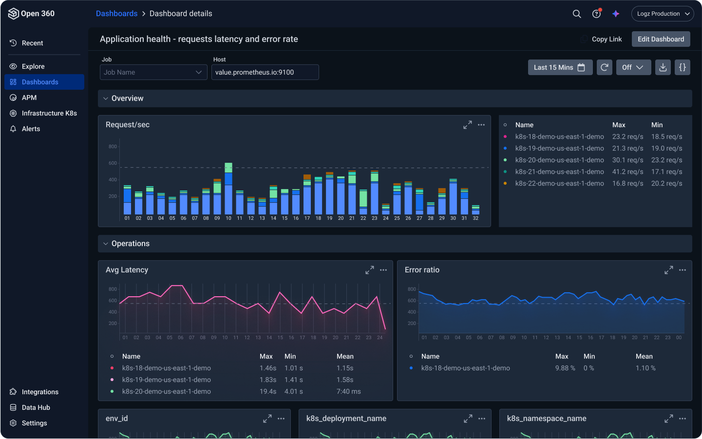
Now, we can see our visualization alongside other information in the dashboard.

Logz.io-added Capabilities for OpenSearch Dashboards
Log queries and visualizations make up the basic log analysis requirements, which we’ve covered so far with OpenSearch Dashboards. For many, these capabilities are sufficient for quickly accessing the relevant information needed for troubleshooting.
For others, log search and visualization alone doesn’t quite cut it. Searching through millions or billions of logs to find a few relevant lines can be tedious, slow, and prevent quick resolution for production issues.
That’s why Logz.io has enhanced OpenSearch Dashboards with additional capabilities to accelerate log analysis, including:
- Full observability: Logz.io unifies log analysis alongside metric and trace data to provide a single place to gain visibility into your infrastructure and applications. Easily correlate across your telemetry types to dive into the root cause of production issues faster.
- Alerting: It’s exactly what it sounds like. Add log queries to alerts to continuously monitor for trends that could indicate a production issue. Trigger notifications to PagerDuty, Slack, Microsoft Teams, and other endpoints. This is also available as an OpenSearch plugin.
- Log Patterns: Automatically cluster similar logs into groups – make it easy to quickly scan through all of your data in seconds. This can accelerate troubleshooting and also surface unneeded log data that can be filtered out to reduce costs.
- Exceptions and Insights: Use AI/ML to cross reference incoming log data with a large database of log messages that have been indicated as critical issues by other engineers. This is an easy way to surface application exceptions that could have easily been lost in a sea of log data.
To learn how you can search through your logs faster to troubleshoot sooner, check out this quick Logz.io Log Management demonstration.
Next Steps for Fast Log Analysis
Effective log management and analysis is all about quickly accessing the right information at the right time, which can be challenging when you’re dealing with mountains of log data.
OpenSearch and OpenSearch Dashboards are excellent options for sorting through the noise to narrow in on the most interesting information. Thousands of engineers use these technologies to query and visualize their data.
However, as your business grows and your cloud workloads expand, log data volumes can explode, which can cause slow OpenSearch queries that impact MTTR. Additionally, many engineering teams prefer to consolidate their observability data into a single solution to avoid jumping across tools to investigate issues.
This is why we built Logz.io, which unifies log, metric and trace analytics on a single SaaS platform built on top of the leading open source observability technologies. If you’re interested in giving it a shot, check out our free trial.
Happy logging!


