
AWS Cost and Usage Report Analysis with Logz.io and the ELK Stack – Part 2
April 5, 2018
This post is the second part of a series about AWS Cost and Usage report analysis with Logz.io and the ELK Stack. Part 1 explored how to ship the reports into Logz.io using Lambda.
This part is usually what people like the most –getting our hands dirty and actually playing with the data. Because the data from AWS cost and usage reports are very detailed, there are a lot ways to slice and dice it. In this part of the series we will show a few examples of what analysis work can be done with data from AWS Cost and Usage Reports and give you the tools to create dashboards that will fit your needs.
Querying the data
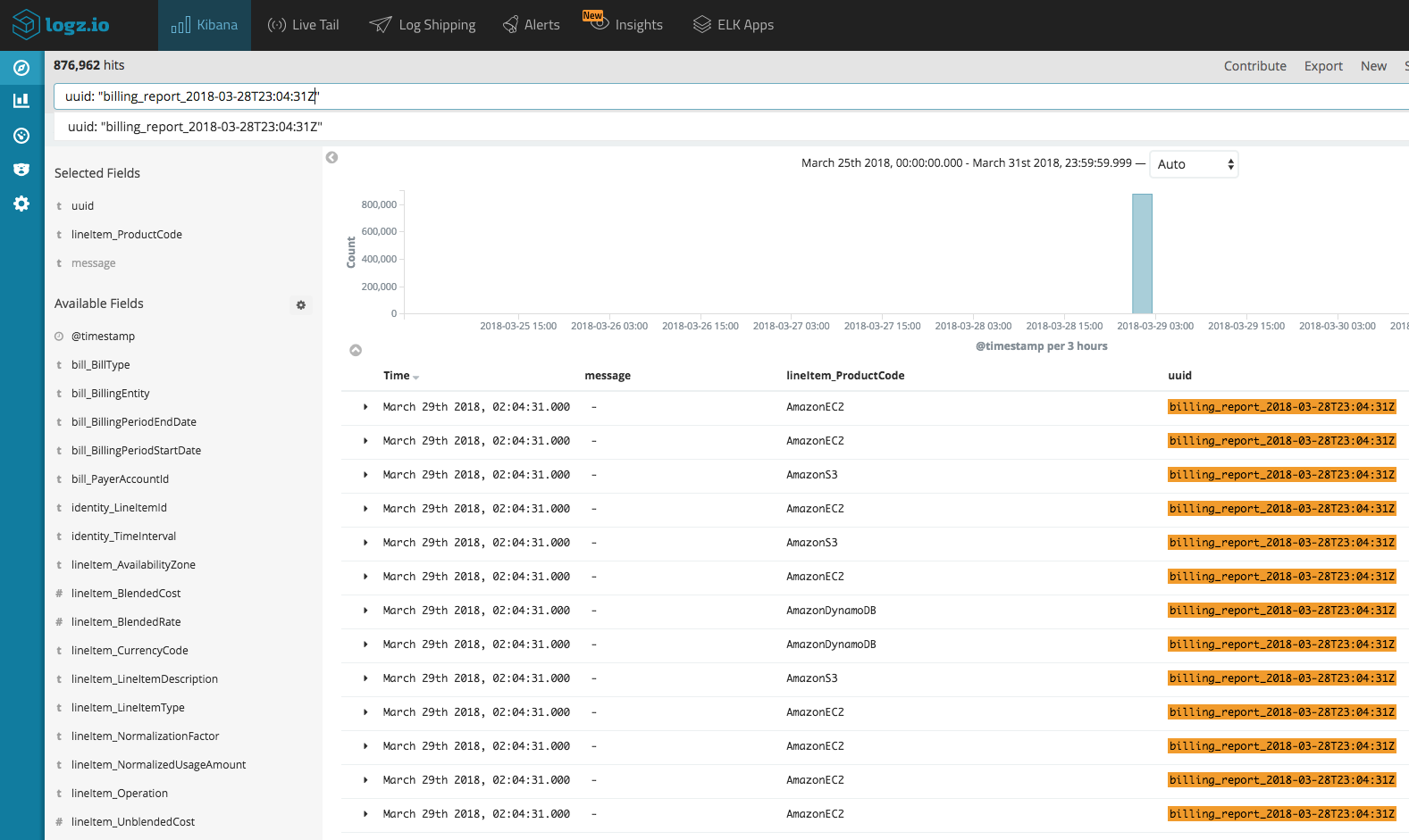
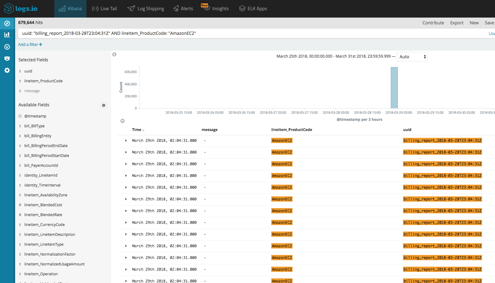
In part 1, we mentioned the fact that the reports are an aggregation of cost and usage data from the beginning of the month. Thus, we need an effective way to select which report we are viewing. Once your report is processed, our shipper appends an identifier to each line in the report by adding a uuid field. The format of this uuid is billing_report_<collect_timestamp> — it is important to filter the data using the report’s uuid before we start building our visualizations and dashboards because some of the data can appear in multiple reports and we don’t want duplicate data.
One way to filter the data to be able to see only the last report is to use a query. For example, let’s show only the report from March 28th:
If you want, for example, to look at cost and usage data for a specific AWS service, you can use a field-level search. Say we only want to show data related to EC2 usage:
Visualizing the data
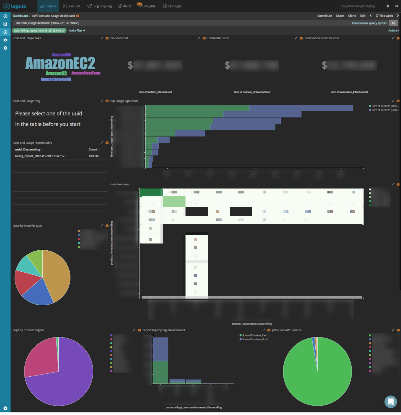
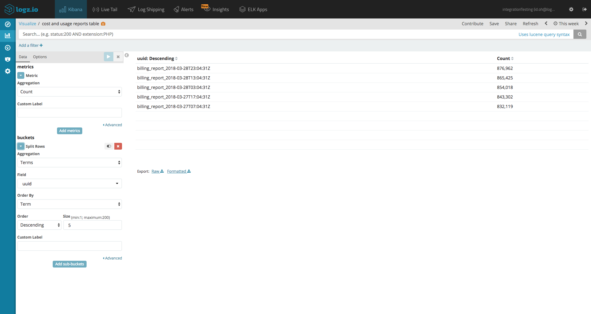
As mentioned above, there are countless ways of visualizing the data due to the richness of the reports. A good way to start however, is to first create a data table visualization that will list all our uuids, sorted by date. This way, we can view all our uuids and filter the data per report.
To create this visualization, go to Visualize section in Kibana and select Data Table.
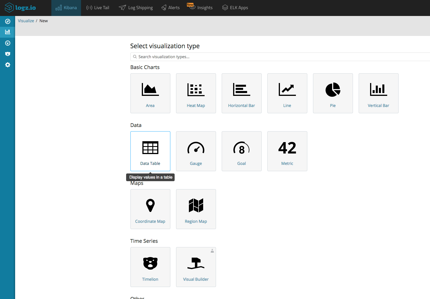
For your metrics aggregation use Count, and for your buckets aggregation use Terms and the uuid field in descending order.
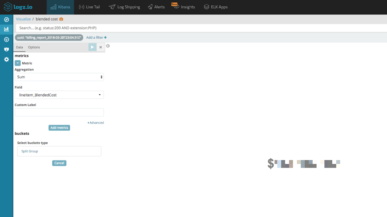
Of course, one of the more interesting analysis that can be done with the data is what I like to call the “show me the money” visualization.
This Metric visualization sums up the blended, unblended, and reservation effective cost. (add the ‘$’ symbol by changing the formatting of the relevant fields in Kibana’s Management → Index Patterns page).
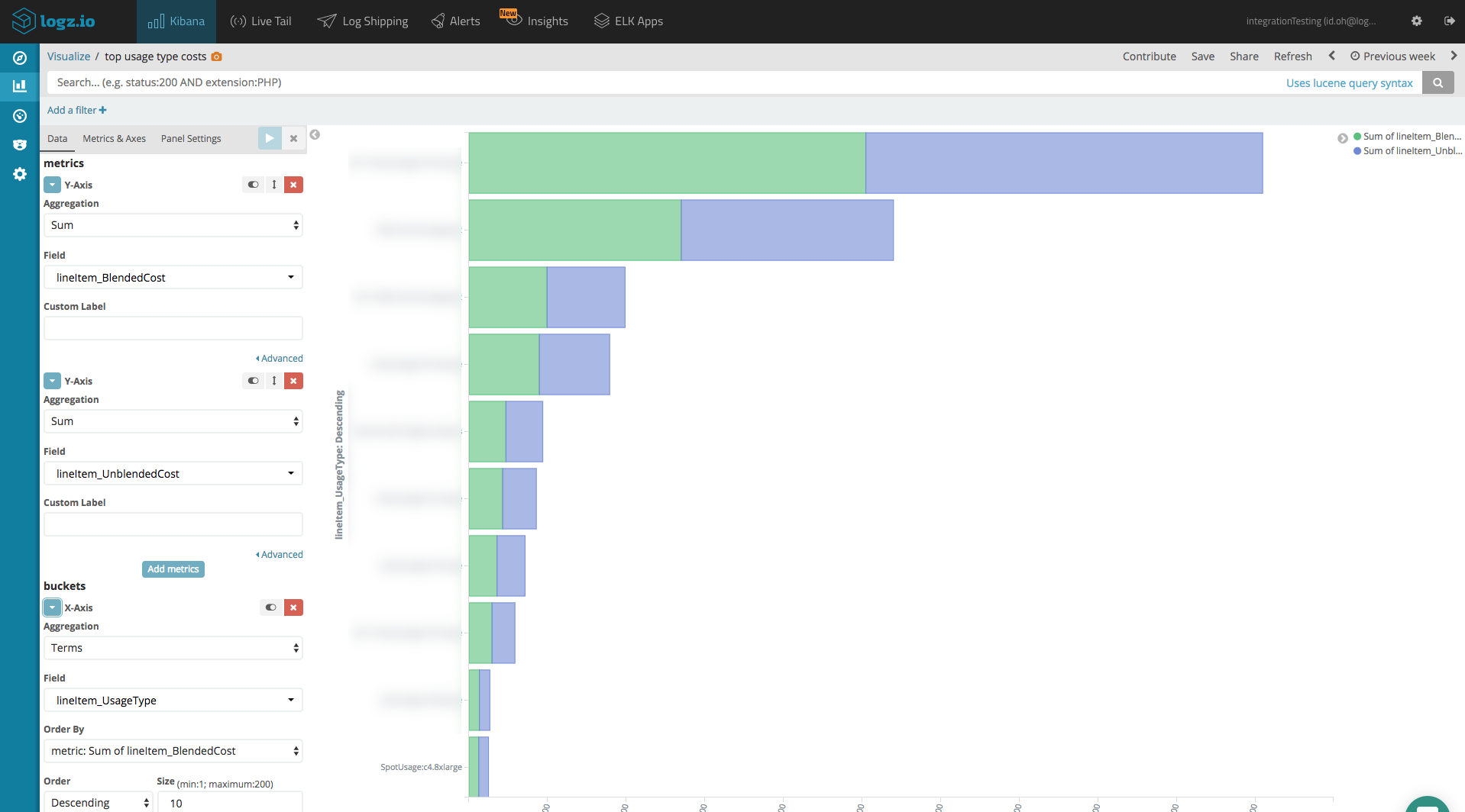
Another great way to visualize costs is to use a Horizontal Bar visualization. Below you can see an example of top ten costs sorted by usage type.
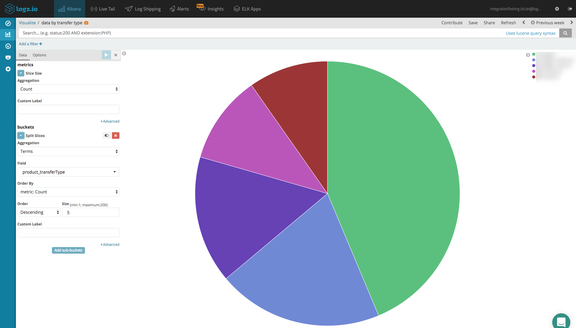
An additional nice visualization is the one that shows us what kind of data transfer type we have in our account. Let’s use a Pie Chart visualization for this one.
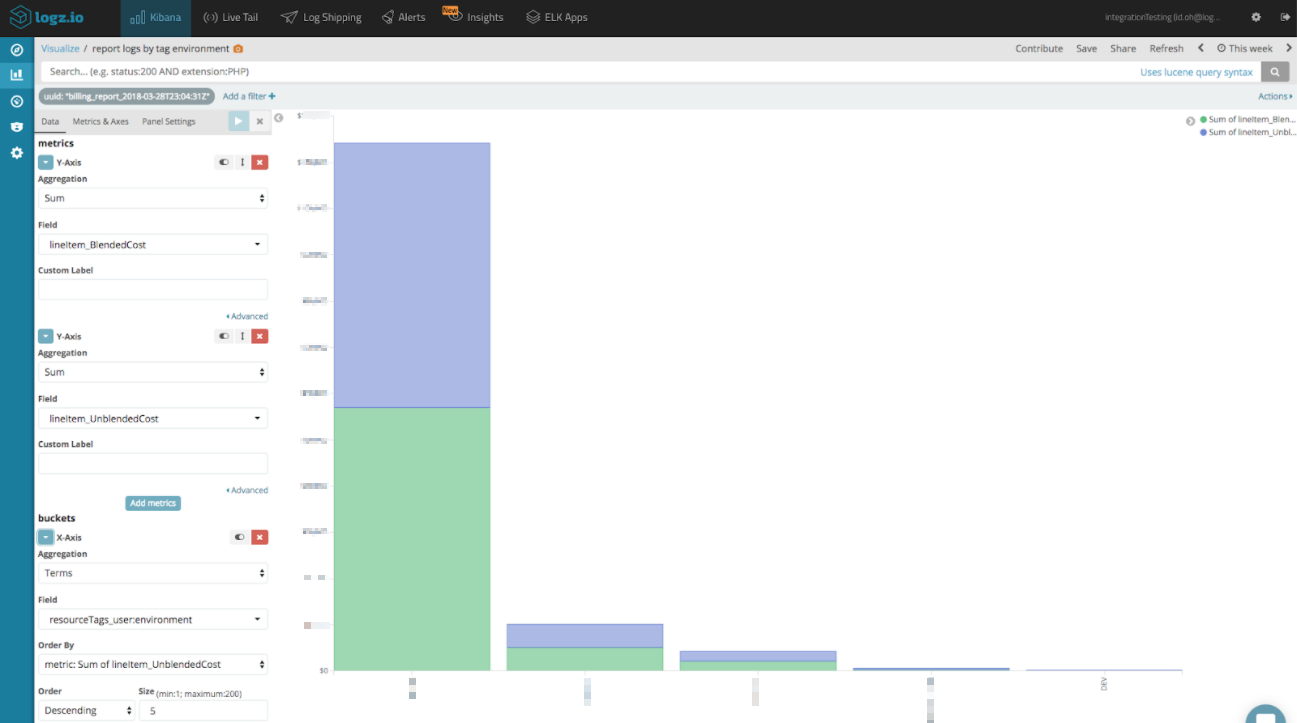
If you are using tags for your instances then the next visualization is for you.
Here at Logz.io one of the tags we are using for our instances is a key value tag for each environment. With this tag, we can show exactly how much each one of our environments spent. If you are not using tags or you want to learn more about it you can visit here.
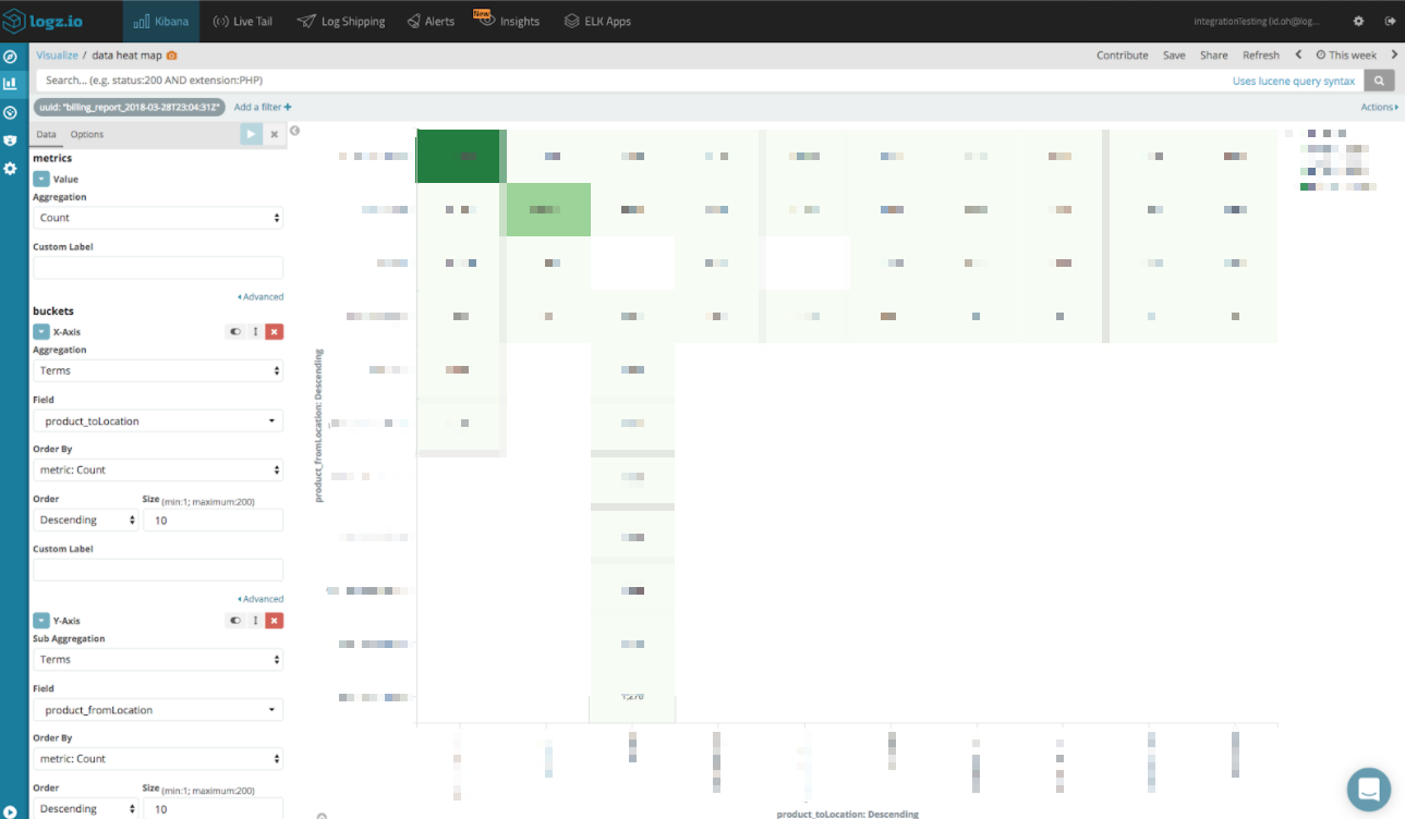
For the last view, we will use Heat Map visualization to monitor our data traffic. For every log line in the report you have a “from” location and a “to“ location tab. We will use these to track our paid traffic routes.
Adding all these visualizations into a dashboard provides us with a nice comprehensive view of our AWS usage and costs.
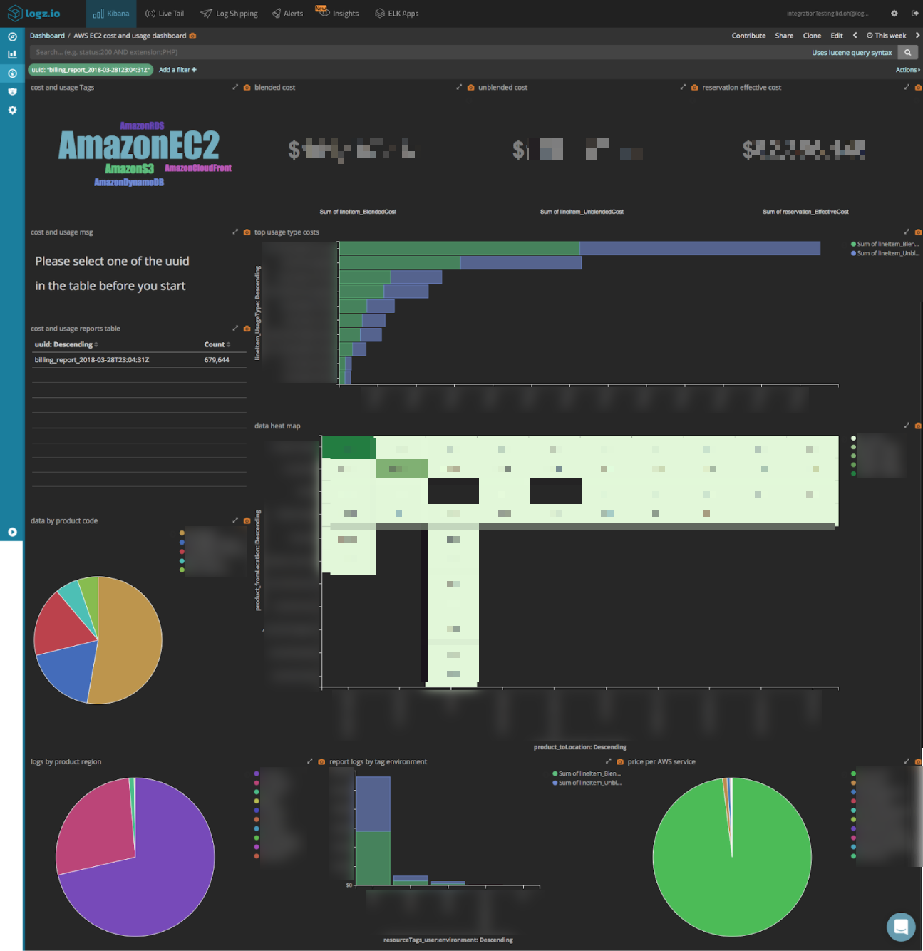
This dashboard is available for Logz.io users in ELK Apps — a library of pre-made dashboards and visualizations for different log types. Simply open ELK Apps, search for “AWS Cost and Usage” and click Install.
Time range query
So you’ve created your dashboard and are happy with the results, but how do you filter by time frame? Say, you only want to look at cost and usage data for the last week?
This can be done quite easily with the following two-step procedure. In this example, we will show how to see only data from the last seven days but you can of course choose any time frame you like.
First, we will need to use Logz.io’s Field Mapping feature to change the mapping of the lineItem_UsageStartDate field to a date field. Open the Field Mapping page under Settings, search for the field and define the mapping as Date (timestamp). Click Refresh Kibana Mapping to apply the changes.
![]()
The second step is to query the last report with the time range we want:
lineItem_UsageStartDate: ["now-7d" TO "now"]
Endnotes
In every company, high-tech related or not, expenses are part of the daily decisions the company makes. AWS provides us with a very complex, but also very detailed, cost and usage report summarizing our application’s charges. Using it wisely can help make your organization much more cost efficient. In addition, the report is very versatile and can be used by analysts, DevOps teams, R&D teams, and finance teams to get some insights for improving the organization in each of these fields.
They say money makes the world go around– and this is especially true with AWS– where you pay for almost every byte you use. In this series, we reviewed how to configure AWS Lambda shipper to process and ship cost and usage reports to Logz.io, and we showed how you can take advantage of the data in the report to help your organization save money and make better use of their AWS data. . We hope you can use this information to make better business decisions and improve your overall efficiency.
You Might Also Like

Can Distributed Tracing Replace Logging?