
Creating the Perfect Kibana Dashboard

The following scenario may sound familiar.
You come across a blog post describing using Kibana to analyze and visualize logs. The article boasts a beautiful Kibana dashboard and you simply can’t help yourself – you decide to try building the same dashboard yourself.
After hackling with Logstash, you finally manage to ship the logs into the stack and then you begin building the individual visualizations in Kibana. You soon find out that it isn’t that simple. How do you get the visualizations to show values for two different fields over time? How do you make your pie charts to look as nice as the author did in the article?
Kibana is a fantastic visualization tool, but actually building the visualizations is not straightforward to say the least. Here are some best practices that will provide you with some guidelines for both strategizing how you visualize the data as well as constructing the visualizations and dashboards themselves.
Understanding your data
Visualizations are built upon the fields constructing your logs. So understanding these fields and the data they represent, is key to visualizing the data correctly.
If you have configured parsing yourself, you should have a good idea on how your logs are structured. In other cases however, parsing is done automatically by Elasticsearch. In this case, the resulting list of fields is virtually unknown.
Start with selecting fields from the list of available fields on the left. You will see the top five values for the field. Some field names are self-explanatory (e.g. ‘bytes’, ‘clientip’), but others (e.g. ‘name’, ‘auth)’ require some additional investigation.
Add these enigmatic fields to the main log display area. Use Kibana queries to search through the logs. These actions will provide you with the context you need for the next steps.
Defining what you want to visualize
Now that you know what data your logs are actually recording, you can begin to strategize your visualizations.
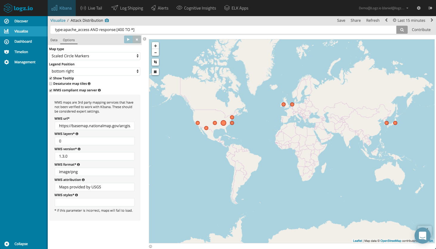
First, define your goal by asking a simple question — what are you trying to analyze or monitor? The answer to this question will determine how you visualize the data. Do you want to see a historical trend over time for a specific field? Do you want to see a breakdown of the top ten values for a specific field? If you are monitoring traffic to your website, do you want to see a geographical depiction of where the originating request is coming from? And so forth.
The answer to this question helps you with two decisions needed for the next step: 1) deciding what type of Kibana visualization to use (the Visualize page in Kibana provides you with a general description of each visualization), and 2) deciding which fields to use for the visualization. If you are shipping multiple types of logs, which is often the case, the answer helps you focus on the required log type as well.
Focusing on logs and using saved searches
You know what you want to visualize, and you know what log type and corresponding fields you most likely need to use. What next?
A recommended way to proceed is to use the Discover page in Kibana to search for the data you’re interested in and then saving your search. Once saved, this search will provide you with a starting point for single or multiple visualizations for building a dashboard. If you decide you want to analyze a different set of data, changing the saved search will change all the linked visualizations accordingly instead of having to change all of them individually.
Saved searches can also be inserted into dashboards, allowing you to embed the Discover tab within a dashboard, giving you good visibility into relevant logs.
Starting, and keeping it, simple
You don’t have to start with a fancy visualization containing multiple sub aggregations. Start simple and expand from there.
If it’s a pie chart visualization for example, use the basic default settings to see a breakdown of the top five results for a specific field.
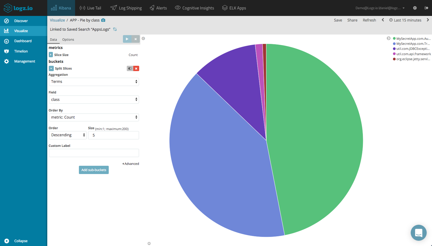
Preview the results, save the visualization and continue developing it by exploring the different configuration options.
Try and avoid overcomplicating your visualizations. The desire to see it all in one place is understandable, but it makes no sense to crowd up a perfectly constructed visualization with a sub aggregation of an irrelevant field.
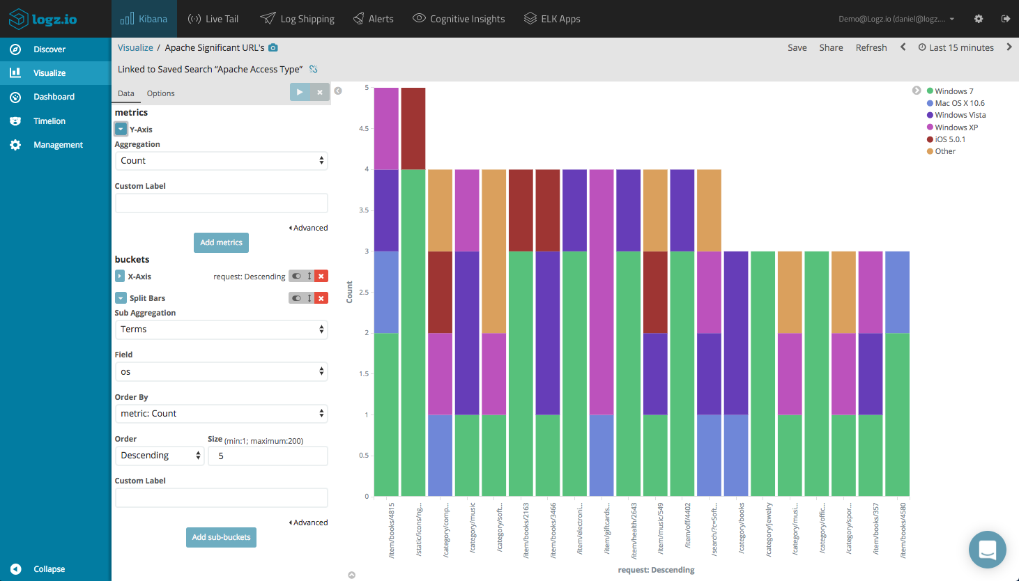
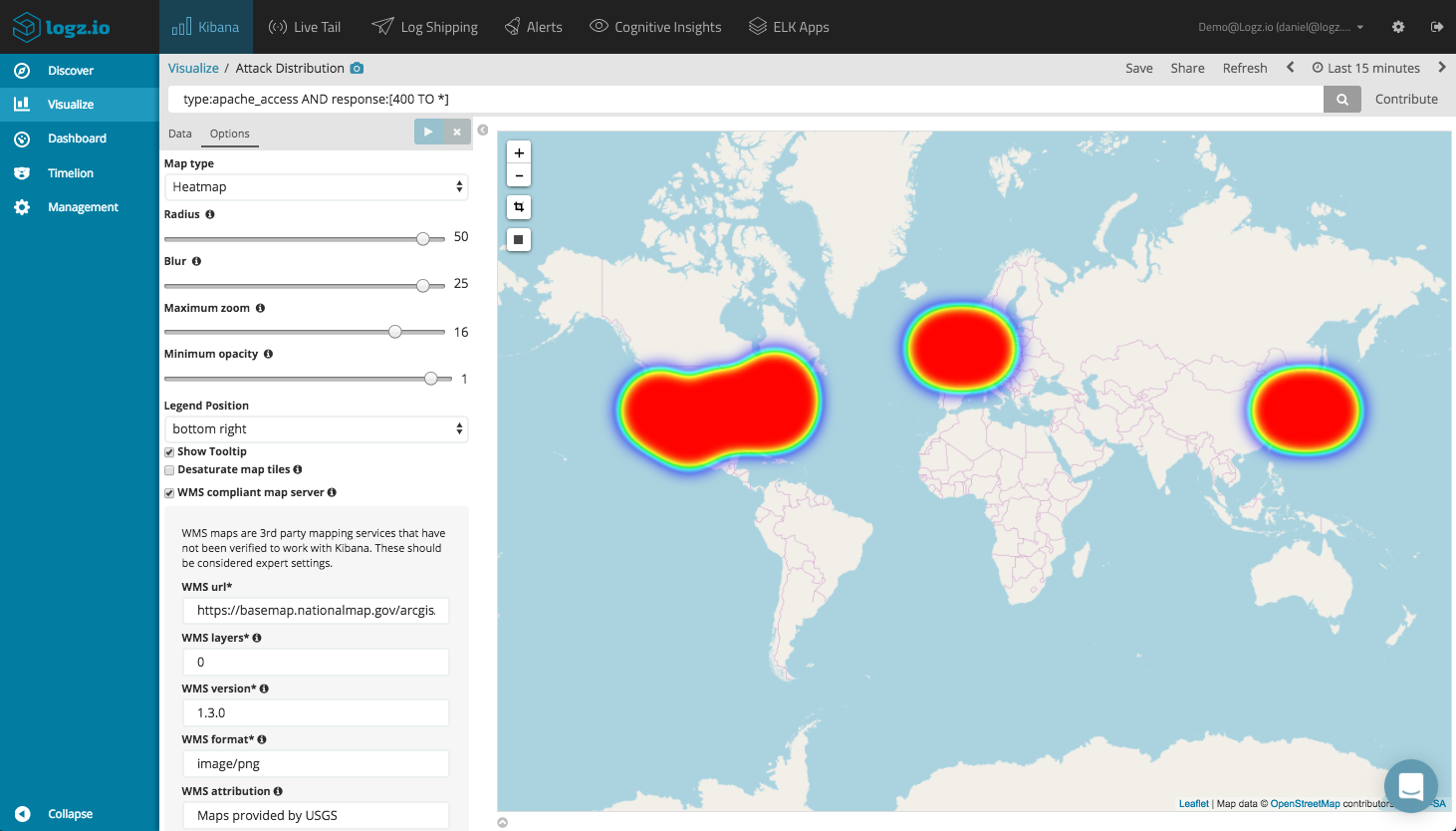
Customizing your visualizations (carefully)
Almost all visualization types feature an Option tab, under which appears a series of additional customization options depending on the visualization type. These options allow you to play around with the way the visualization is displayed and can be very useful in making your chart or graph more readable.
Be careful though, and if it ain’t broken, don’t fix it. You may find your visualization transforming from a clear graphical depiction of the data you’re analyzing into an indiscernible mess.
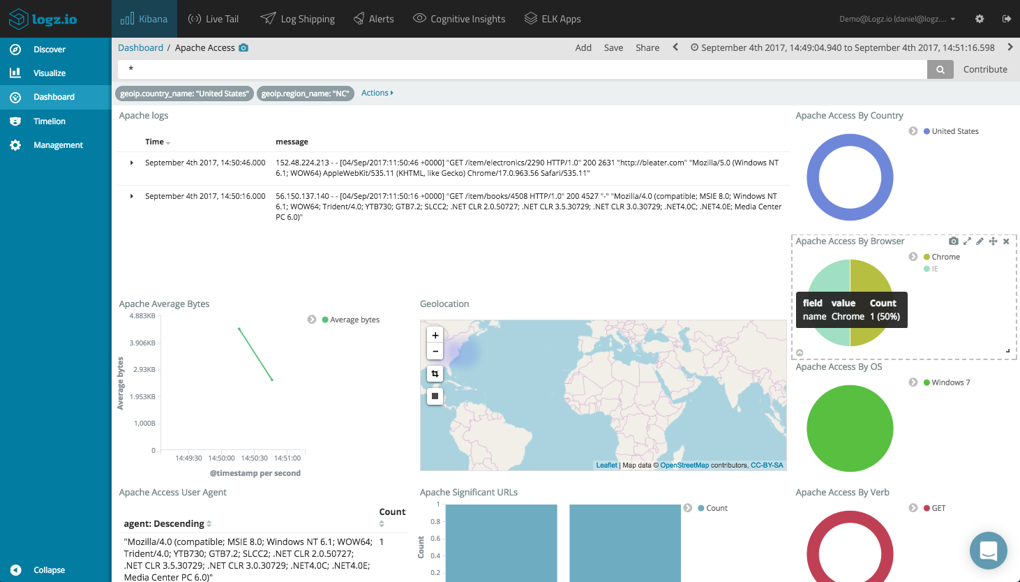
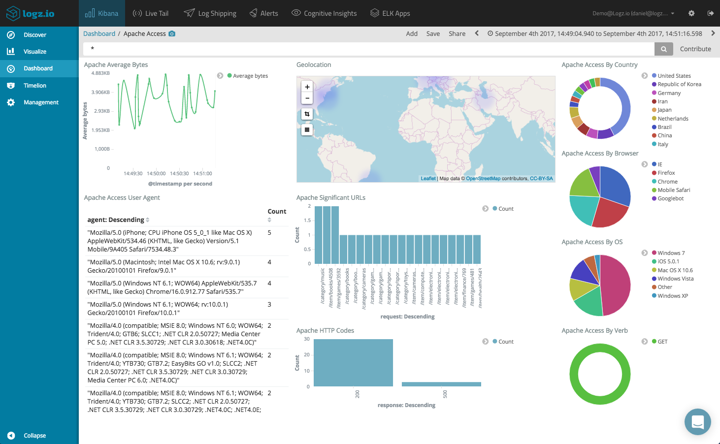
The Art of Dashboarding
Once you’ve got your ducks – or visualizations – set in a row, it’s time to think of combing all your visualizations into a comprehensive dashboard. In practical terms, nothing could be simpler, but similar to visualizations, some thought needs to be given before you begin piling up all the individual visualizations.
The main factor determining what your dashboard will look like is its purpose or goal. A system monitoring dashboard will look entirely different compared to a dashboard built ad-hoc to troubleshoot an issue in production.
This factor also affects the number of datasources used for the dashboard. Multiple data sources are effective in getting a general overview of a system, but not useful for drilling down (drilling down, or selecting a field, in a visualization built on a specific datasource will render any visualization built on top of a different datasource useless).
More on the subject:
The same best practices outlined above for visualizations apply for dashboards. Keep it as simple as possible, and don’t overcrowd a dashboard. Not every visualization you’ve built in the history of time needs to be included in the same dashboard. If possible, I usually try and avoid the need to scroll up and down in a dashboard.
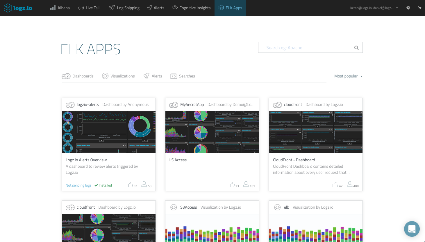
About Logz.io ELK Apps
Providing an end-to-end hosted ELK service, Logz.io ships with a built-in library of pre-made searches, visualizations and dashboards for different log types called ELK Apps. This library, which is maintained and developed by the Logz.io community, already includes hundreds of entries and is expanding on a daily basis.
Want to contribute your own visualization? Read this blog post for more information on submitting a visualization or dashboard to ELK Apps.
You Might Also Like

Introduction to the Logstash Grok

How to Create Cost-Effective Infrastructure Monitoring
Get started for free
Completely free for 14 days, no strings attached.